
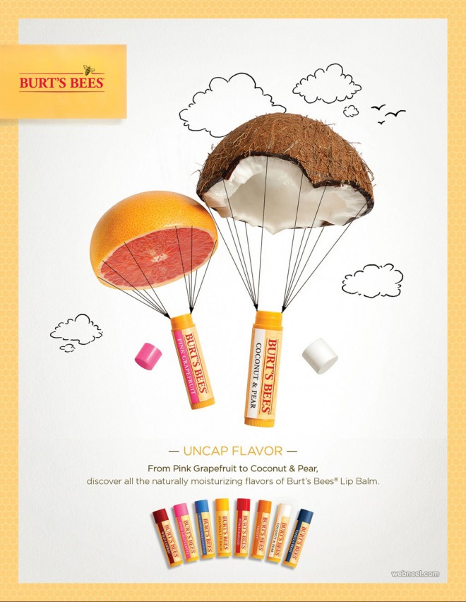
Burt’s Bees is a personal care company that describes itself as an “Earth friendly, Natural Personal Care Company.” I was drawn to this ad because of how simple, yet pretty it is. Customers like Burt’s Bees products because they’re made of natural ingredients customers know won’t harm their bodies. The use of the large coconut and orange perfectly targets this aspect.
In terms of design, the simplicity is very impactful. The imagery of the lip balms floating down creates an airy image in the mind. The use of parachutes and simple drawn in clouds in the background creates movement without overcomplicating the overall image. In addition, I like the varying textures used because it makes the fruits pop and highlights what the company needed to get across to the consumer (that their products are natural). The honeycomb border is also a good touch because it ties the ad to the company without using just the logo. Also, the use of a normal font follows suit with the simplistic design elements.