
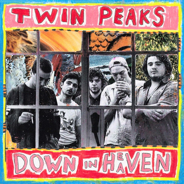
This is the cover to an album titled Down in Heaven by the band Twin Peaks. The group is an indie-rock band from Chicago and this album came out in 2016. Their other album covers are also pretty interesting which is why I thought to choose this cover for the assignment.
As a whole, I think this cover is easily representative of the genre the band sings. Before breaking down and discussing the image and principles used to create this cover, the work as a whole immediately represents the band as “indie”. The image of the band used on the cover is an interesting juxtaposition against a background of differently colored images, framed by a window. Although the images in the background seem completely different, there is an overlying texture that carries across the image of the band and background and ties the two elements together. In this way, the tiled background and black and white image of the band become one, contrasted by a brightly colored hand drawn frame containing the title of the band and album. The frame is drawn in what seems like crayon and the texture works well against that of the grainy pictures.
Some of the drawing on the frame continues into the center of the cover and is smudged across the black and white image. I am really drawn to this graphic because there is so much contrast but I think it comes together really nicely. The muted earth tones in the back don’t clash with the bright primary colors in the frame because the black and white image works as a sort of bridge, bringing the two together. There is so much contrast but each individual element is balanced with an aspect that brings the art together as one whole.