
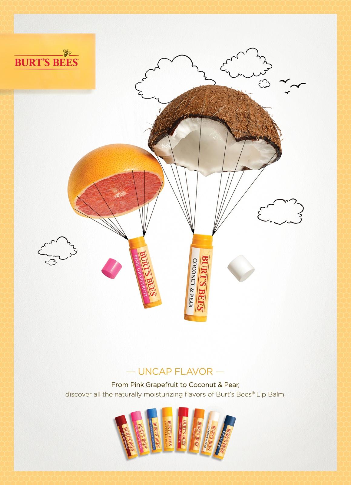
This ad showcases Burt’s Bees popular lip balm by pairing it with a simplistic white background and very on brand yellow bordering. The colors of the pink grapefruit and coconut labeling really pop and are displayed in a creative, clever way among clouds.
Displaying the products in the sky around clouds is a very good choice for the company because the main imagery for their logo is a bee AND they’re able to play with the idea of “reaching a new level” while wearing their products. Burt’s Bees can also demonstrate the smoothness of their lip balm with the “smooth landing” idea behind the coconut and grapefruit parachutes.
Not only are the fruit parachutes colorful and eye catching, but also, they address industry transparency and the organic, no nonsense nature Burt’s Bees aims to emphasize with all of its products. The contrast against the plain, solid background makes the company’s products and values stand out.
This ad is so clever because it captures your attention in a bold, colorful way and displays the ideas of lofty, smooth flight and organic transparency to absolutely embody brand values, logo and imagery.