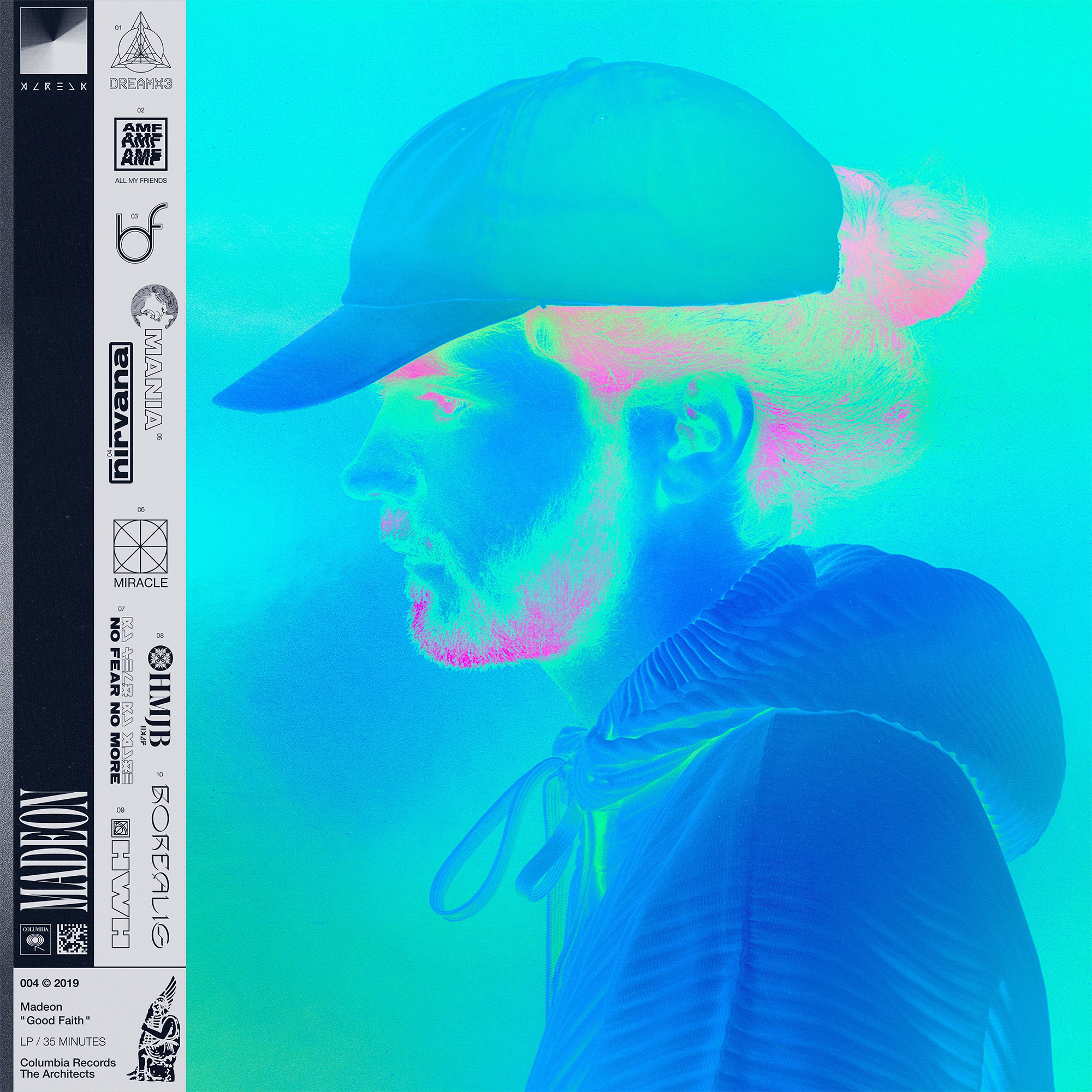
This is the cover for the 2019 album Good Faith by Madeon, an electronic-pop artist. I’ve always been quite a big fan of Madeon, but this album specifically was very visually inspiring.
The album’s promotional art uses a theme seen in the album cover – the vivid recoloring of the world. The cover sports a vivid turquoise portrait of the artist, capturing very well the way the music on the LP paints the everyday world with sparkling chords and lyrics.
One of my favorite aspects of the design of this cover is the logo series on the left. Each song on the LP has its own very detailed logo, adding a feeling of depth and structure to the cover. Each logo is so unique that it lends striking identity to each song on the LP – it’s as if each song is its own character in a movie with unique characteristics. I think the logos are very creative as well – for example, the logo for “Be Fine” (03) uses fluid typography to make a very modern logo out of the letters b and f. The logos work together to make a cohesive body and don’t seem to really get repetitive.
Finally, I really enjoy the “print” look the cover is going for. The strip of print on the side with paper textures over it being separated from the artwork itself feels like a direct reference to Japanese CD packaging and obi strips, which is something not really seen often. This separation between the colors and the print also makes it a little more eye-catching, drawing the eye initially with the bright turquoise and then intriguing the viewer with the complex logos and type.


