
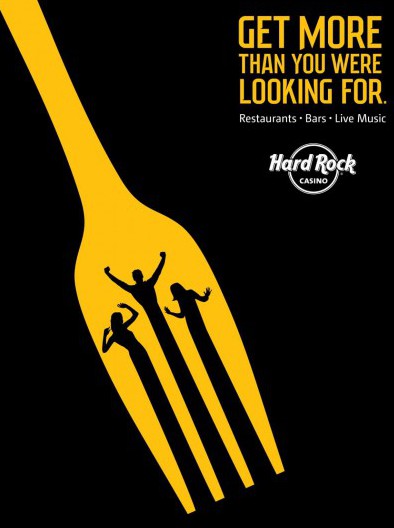
The image I chose was an ad for the Hard Rock Casino. This ad appealed to me in several ways. The first is the choice of color. With there only being three colors in the image, yellow, black and white, it is very appealing to the eye and you don’t get distracted. I also like the choice of using a fork to represent the restaurants that are at the casino, and having dancing people incorporated inside of the fork to represent music and dancing.
This choice of yellow could be related to the fact that psychologically we associate yellow to happiness or freshness. And when going casinos you don’t always leave happy and fresh but that might be how companies like Hard Rock convince people to come in. The yellow could also represent money and coins since the Hard Rock is a gambling space.
The use of balance is also included in this image by having bigger bold text in the top right and then the focus image on the left half of the image. The rest of the image would be dead space allowing you eyes to only see the two sections.
The text that is in this image also does a lot more to the emotional feel. With most people going to casino for gambling purposes, Hard Rock wants it known that there is more there to do. It’s a full experience and you won’t need to go anywhere else to have a good time.