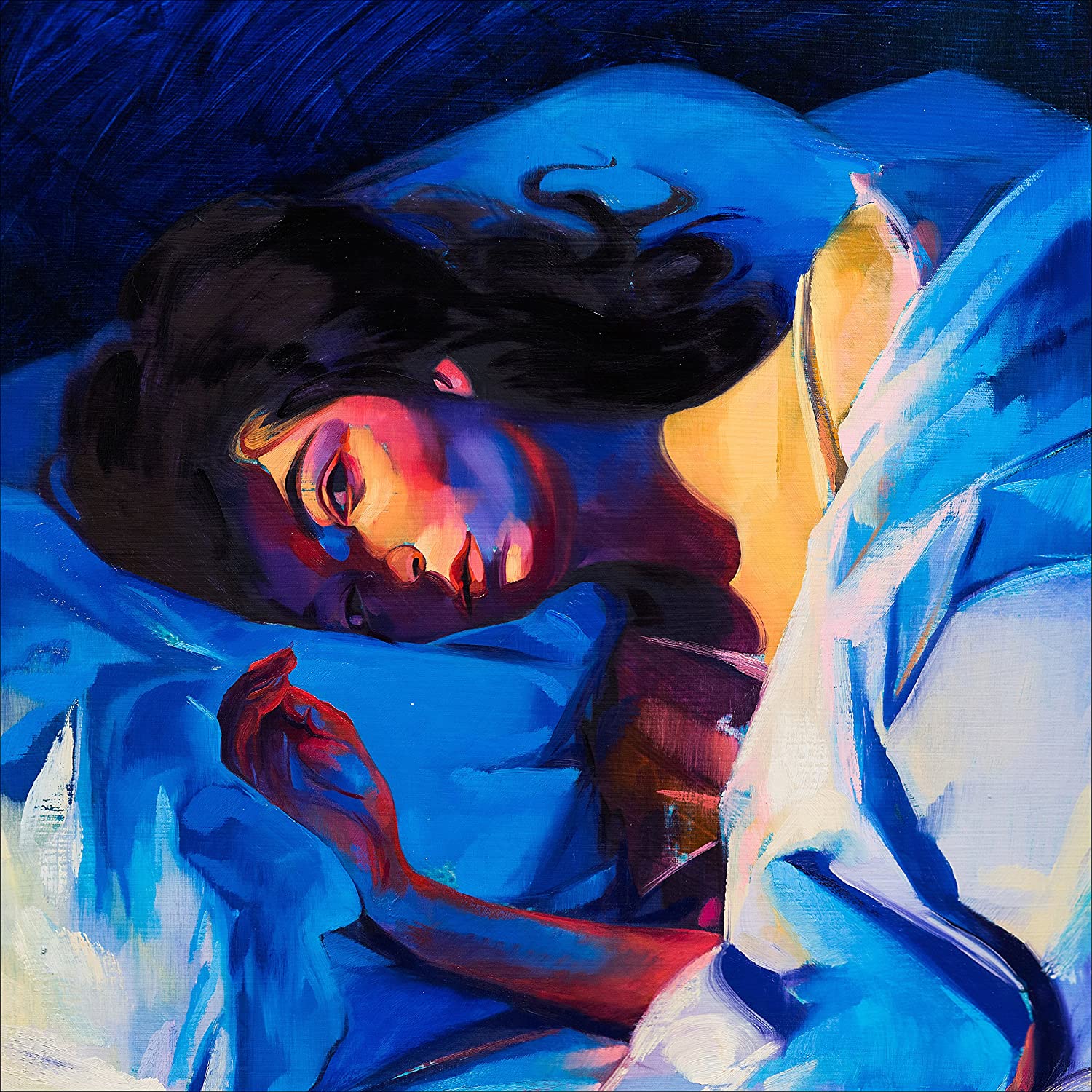
This design is the album cover for Lorde’s album, Melodrama, a pop artist. I chose this design because this album’s song, harmony, beat, and meaning stand out to me among a lot of albums I have heard. In addition to the album’s songs, I wanted to use this post to appreciate the album cover’s elements of design that contribute to the album’s meaning and aesthetic.
“Melodrama” is defined as a “a sensational dramatic piece with exaggerated characters and exciting events intended to appeal to the emotions”. The songs in Melodrama express intimate emotions boldly in music and lyrics. In this design, there is a monochromatic scheme of cool colors around Lorde laying down in the bed. Psychologically, cool colors hint depression, melancholy, or lack of life. The blending of cool colors in the bed is clean and there are no colors trying to dominate the smooth and untouched bed. The walls and bed contrasts each other, with a darker hue of blue on the wall. This change in value creates depth in the design, that contribute to emptiness and feelings of solitude. The cool colors, blending, smooth texture, and value of this aspect of the design create an emotion of loneliness and depression in the background.
In this design, Lorde laying down on the bed stands out and contrasts from the design. Unlike the cool colors surrounding her, there are warm colors of orange, red, and yellow that dominate her body. Warm colors evoke emotions of love, passion, and joy. These emotions contrast the emotions expressed by cool colors. These colors in Lorde’s body depicts the emotions she feels inside her body. However, there are also cool colors of blue in her body that are not blended and try to dominate her arm and lower facial structure. The variety of colors dominating her body depict diverse emotions she experiences. One cannot always love and feel joy, for there is always sadness in the world. The colors in Lorde’s body also don’t blend as well as the cool colors in the wall and bed do. There are colors that stand out and contrast each other instead of cleanly blending together. There is complexity in the mixture of these various colors, depicting Lorde’s complex and diverse emotions.
This design depicts the exaggerated emotions Lorde creates in her music in this album by using contrasting colors, texture, and value. The design successfully shows the complexity of emotions trying to dominate one another in an individual using these elements of design

