
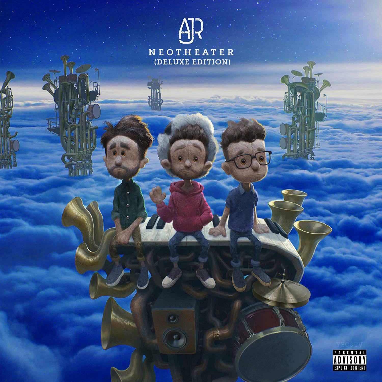
AJR’s latest album, Neotheater, was met with rave reviews and much love from fans of the band, but I almost feel as if it didn’t get enough praise, specifically for the design of their album cover. I feel that there are many aspects that make this album cover so endearing, starting with the vibrant colors used in the design.
The colors used in this album cover are stunning because of the (in my humble opinion) perfect balance of contrast. The use of such an otherworldly blue in such a vast sea of clouds with a brightly lit sky and stars shining above show clue into the vibe this album is attempting to convey. When contrasting the vastness of the scenery against the looks on the three band mates’ faces, a new meaning is given to the album and the songs within it.
Another element contributing to the allure of this design is the striking human-like qualities and emotional expressions of these plush representations of the band members. These elements combined give way to a story and give meaning within something as simple as an album cover, made possible only by careful considerations in the design of the faces of the plush band members.
This new meaning conveys a sense of wonder, thrill, and excitement shown beautifully in the clouds and sky, but is slightly broken down by the looks of uncertainty and humbleness on the band’s faces. They’re simply along for the ride at this point, there is no way down from the towers of instruments that have carried them this far, way into the clouds, higher and more popular than they ever thought they would get. They have to adapt to this new, unfamiliar, even uncomfortable situation to continue to produce better and better music.
Ryan, at right, looks of into the distance with a sort of wonder in his eyes. Adam, at left, looks longingly into the distance like Ryan, but with a more somber, quizzical look on his face, as if saying “How are we going to manage this?” This is made more impactful when considering that Ryan is quite a free spirit within the band, while Adam is more quiet, reserved, and business-minded, as he produces all of the songs the band puts out. All the while, Jack, at center, the near-definitive face of AJR, simply smiles and waves directly to their audience, accepting whatever comes next at face value. We now see exactly what the album is trying to convey; AJR’s struggle between childhood and adulthood, whether to have fun or worry, to just play music or to look at the band like a business, but ultimately having to face the audience, smile, wave, and take whatever comes their way.
It is entirely possible that I read further than intended into the meaning of this album cover. But truly great design conveys a message or tells a story, and even if that message or story isn’t crystal clear, it leaves it up to the imagination, offering subtle hints and nods to those who let their thoughts run wild.