
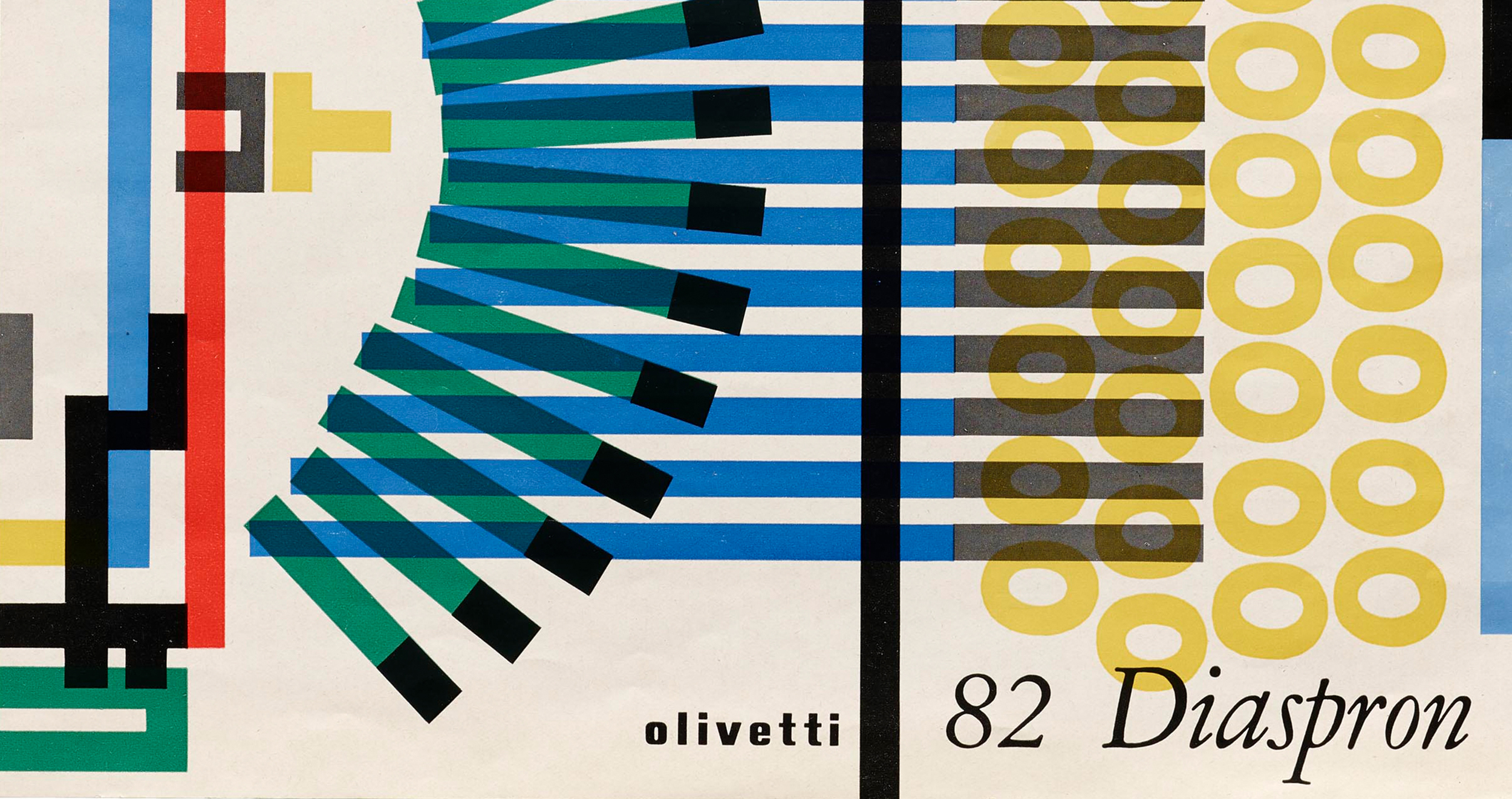
This is an advertisement for an Olivetti 82 Diaspron, an Italian typewriter popularized in the 1950’s. Olivetti owed its success as a company in part to its striking advertisements for its machines. There are many poster designs for Olivetti typewriters out there, but this one stood out to me in particular. It uses very simple shapes, rectangles and circles, to represent an aerial view of a typewriter. The smoothness and uniformity of all the components gives the design elegance, adding to its value as an advertisement. Although it is not a detailed portrayal, the viewer instantly knows what is being advertised. The focus of the ad is immediately on the mechanisms and functions of the typewriter.
Another aspect of this design’s appeal is its choice of colors. These four colors are bright and contrasting, making the typewriter seem like a cheery decorative piece as well as just an ordinary piece of office equipment. They also allow the different components to be translucent and overlapping, which makes the design more interesting. These four classic shades of red, blue, green, and yellow also serve as a reminder of the different colors of ribbon the typewriter was capable of using. Olivetti used these four colors in most of its other typewriter advertisements too, which helps its audience recognize the brand and gives it a uniform quality.
The type used for the company and product names are simple and refined, qualities that many people still value the typewriter for. The clean black text stands out clearly against the very colorful parts of the design. The cream background color reminds me of the high quality paper I usually associate with vintage typewriters, and it is less bright and harsh than a pure white background would have been. Overall, this advertisement is highly effective in that it highlights both the typewriter’s functionality and aesthetic value through its beautiful design.