
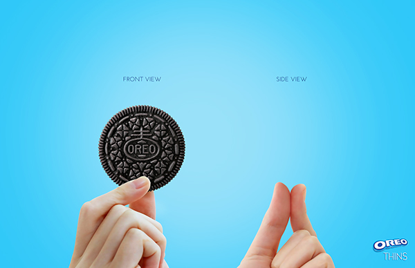
This is an advertisement for Oreo’s specific cookie called Oreo Thins. I was drawn to it because of its simplicity and the calming, sky-like blue background. Additionally, with the product displayed as large and central it caught my eye and I immediately knew it was for an Oreo cookie.
The image illustrates the front view of the cookie as the same Oreo patterned cookie their customers have come to love, but the side view shows nothing. This plays on the idea that these new cookies are so thin it’s like they’re not there. This could be a marketing strategy encouraging people to not feel guilty eating more of these cookies because it’s as if you’re not eating much of anything.
The text labeling the views is small, drawing more attention to the cookie itself (or lack thereof). The only other text present is the iconic Oreo logo with its new “THINS” in the bottom right as a reminder that this is indeed an Oreo product. The font used is also a relatively thin font, reinforcing the fact that these cookies are not thick.
The colors used, excluding the hands and the cookie itself, are the different shades of blue (in a soft radial gradient) present in the Oreo logo and its respective packaging on products. These blues combined with the black cocoa cookie is a color combination that draws attention to the cookie and leaves the background less distracting.
The positioning of the hands is also designed well. Rather than using an entire hand, only a few fingers grasp the cookie (again, or lack thereof). The fingers almost point at the cookie and draw the eye to what they’re holding rather than to the hand itself.