

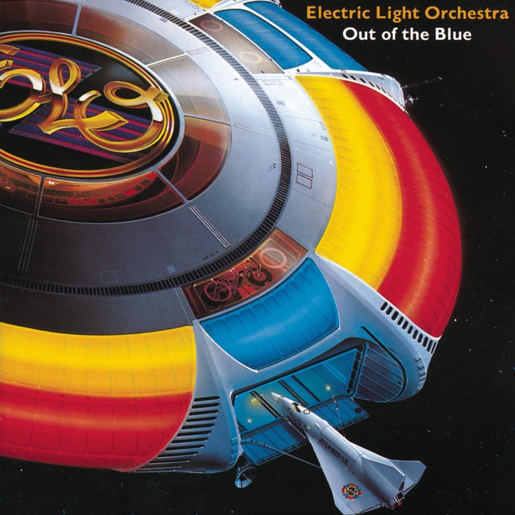
Original Album Cover 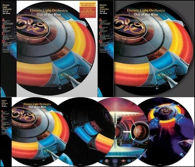
40th Anniversary Edition
The album Out of the Blue by Electric Light Orchestra (ELO), is not only iconic due to its music, but its cover as well. ELO was a group that my parents grew up to, and as a result myself as well. However, the album cover of “Out of the Blue” is what really got me into their music.
The album cover being space themed helps the listener to expect what is coming up in the album. Songs like “Steppin’ Out”, “Night in the City”, and “Across the Border”, convey the same feelings of emptiness and curiosity of the unknown, as well as the stereotypical extraterrestrial sounds that would be associated with space.
The mostly primary cover scheme contrasting a mostly black space background helps to guide the eye to the central element of the piece; the spaceship. The grey area of the spaceship looks like a record itself, and the exterior reminds me of a juke box. The shape of the spaceship was intentional, keeping in mind that records were still a thing, and there are versions of the album over that had the full, circular ship, on display (see second photo).
I also think the way the spaceship was designed helped to convey the sense of a system, or ongoing theme. Under the ELO is a control room, and the other areas of the ship of that same coloring display the inner workings of this ship. It helps to correlate to the music in the album, as every song contains very similar musical elements that connect to each other.
Overall, I believe this album cover serves as a gateway to the songs it contains. For those who have never heard any song by ELO, the cover is captivating enough to pique someone’s interest, and for fans, it helps to connect what they are hearing, to what the group wants you to visualize.