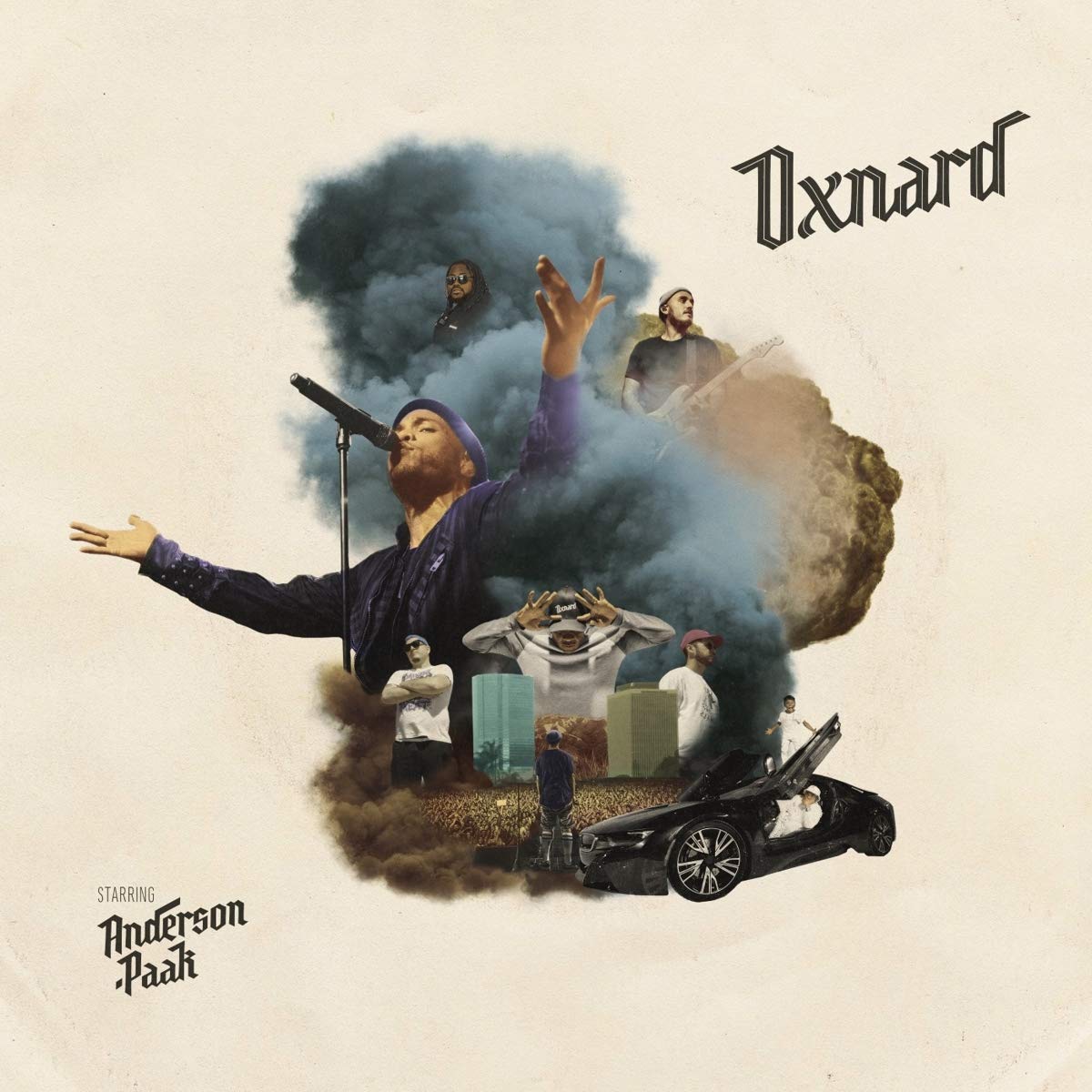
I chose to talk about the album art of Anderson .Paak’s album Oxnard. I feel that one of the smartest things done in this art is the use of negative space around the central imagery. It makes everything within these bounds feel small and compacted. This coupled with the clouds of smoke that consume the center of the image creates a dream like feeling. This is part of what I find so interesting about the image because it isn’t using the typical whimsical pastel imagery commonly associated with idyllic dreams, but rather creates the feeling of a more realistic dream; a bit more dark, compacted, almost clustered with all the images of his band mates floating in the smoke. The earthy colors gives a feeling of weight and gives off an almost intimidating feel. In this way it almost tells a story showing .Paak achieving his dreams while at the same time feeling almost smothered by that success and the unforeseen struggles and nerves that come with it. This idea is only solidified by the central image of .Paak standing on a stage overlooking a crowd of thousands of people, and while we can’t see his face, his body language gives a feeling of being simultaneously mesmerized and paralyzed by nerves. The album’s art perfectly captures that emotion that comes with being an up and coming artist in todays world.