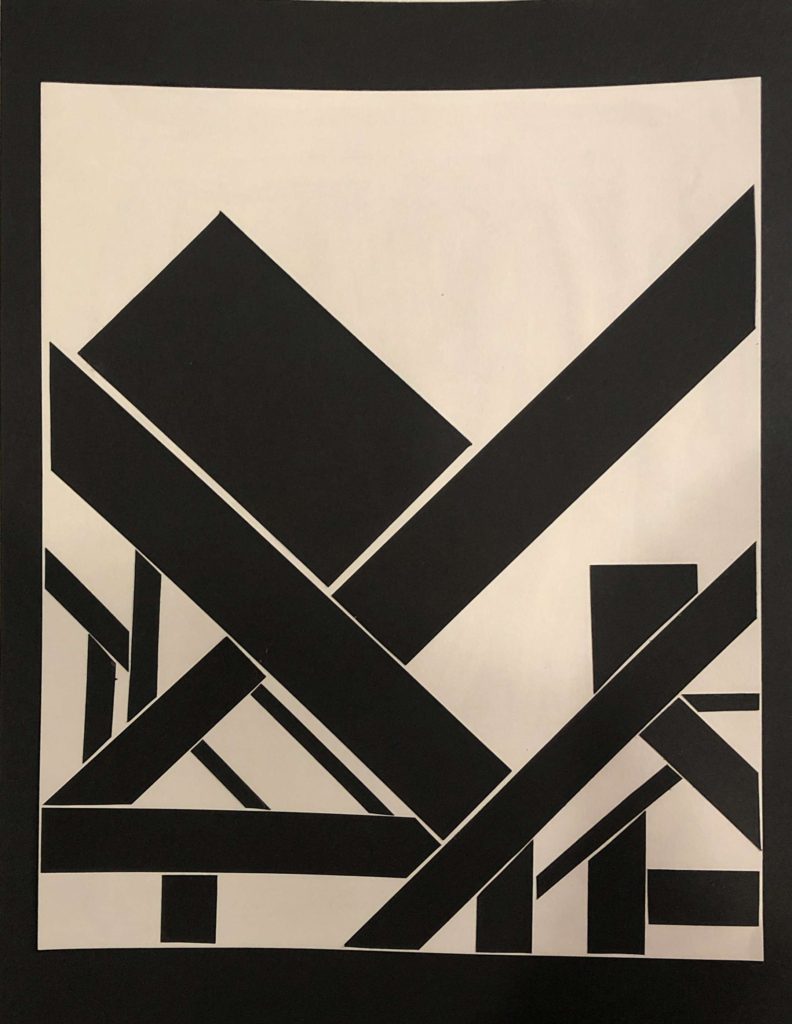
These are hard for me to conceptually digest. I think in both solutions, the variation of line weight, variation of space between the lines, and the overall composition reads as a pattern (cloth, woven, or plaid) – I think you did these things successfully.
What irritates me about these solutions is the box in both. The large rectangular slanted box on the left throws me off because it’s unlike the rest of the woven pattern below it. It feels heavy. I do like the half box peaking out of the line below it though. I think that shape is more interesting and looks more involved with the lower half of the solution.
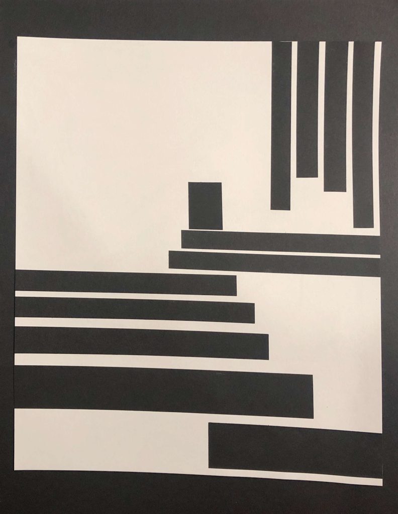
In the second solution, I see how the box could read as a narrative or add perspective (like a figure at the top of a staircase kind of thing). Overall though, I don’t like the box cus i think it disrupts the pieces composition but if you made the box with a narrative intention – then sure I guess.
I’ll respectfully disagree with Janelle. None of these register as flat or decorative for me. While the diagonal piece is shallow in space, it does evoke a spatial overlap and as I mentioned in crit it has a great sense of weight and tension. And in both of the first two pieces the “box” that Janelle refers to serves nicely as both a focal point and key element of the narrative.
The curve design divides the page nicely and has a loose, airy vibe. Also love the graphic handling of the zigzag in the combo and feel the 3 curve lines are the only elements off-key.


These are hard for me to conceptually digest. I think in both solutions, the variation of line weight, variation of space between the lines, and the overall composition reads as a pattern (cloth, woven, or plaid) – I think you did these things successfully.
What irritates me about these solutions is the box in both. The large rectangular slanted box on the left throws me off because it’s unlike the rest of the woven pattern below it. It feels heavy. I do like the half box peaking out of the line below it though. I think that shape is more interesting and looks more involved with the lower half of the solution.
In the second solution, I see how the box could read as a narrative or add perspective (like a figure at the top of a staircase kind of thing). Overall though, I don’t like the box cus i think it disrupts the pieces composition but if you made the box with a narrative intention – then sure I guess.
I’ll respectfully disagree with Janelle. None of these register as flat or decorative for me. While the diagonal piece is shallow in space, it does evoke a spatial overlap and as I mentioned in crit it has a great sense of weight and tension. And in both of the first two pieces the “box” that Janelle refers to serves nicely as both a focal point and key element of the narrative.
The curve design divides the page nicely and has a loose, airy vibe. Also love the graphic handling of the zigzag in the combo and feel the 3 curve lines are the only elements off-key.