These are all nicely crafted and designed. I’m assuming these are all glued down, so editing probably isn’t likely at this point but here are some thoughts:
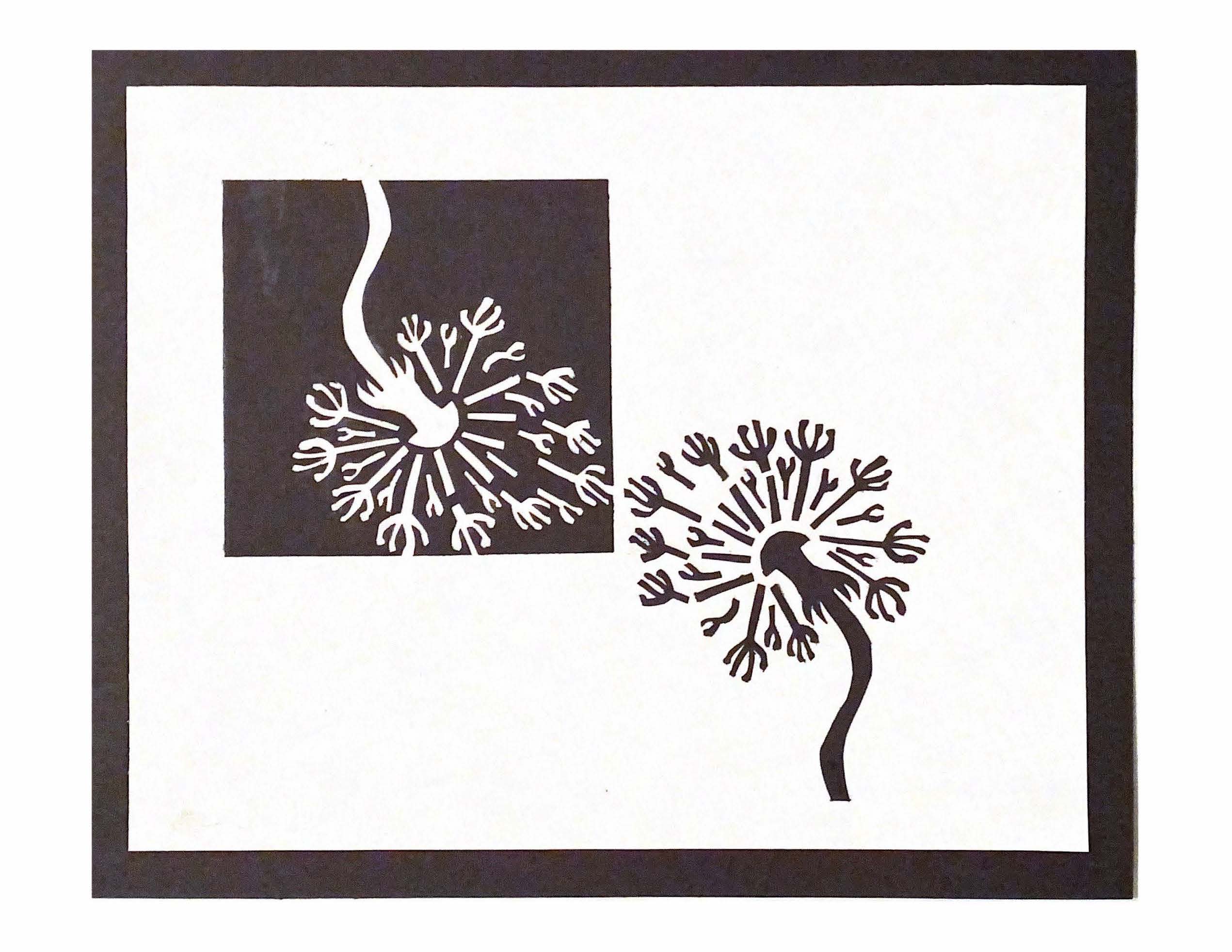
1. I like that you kept a bulk of the square present and that there’s an interesting interplay between the two “characters” which are odd and playfully ambiguous (are they dandelions, rockets, hands – who knows?) It might have been interesting to play with a non-mirrored variation of the element outside of the box to see if the space could be better activated by spacing the remaining pieces out in a different way. So many possibilities.
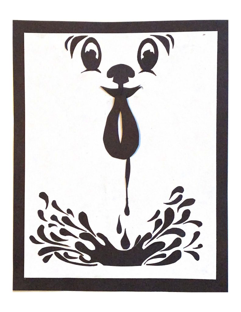
2. This has nice graphic concision and playful shapes. The top and bottom elements are strong in design and placement, but the spilling vase element (?) feels a bit static. Still a very good piece for a challenging assignment.
3-4. These both feature great shape work, but I think the lava lamp has a better sense of scale. You also get a little reliant on central elements in the last three.
Hi Lena!
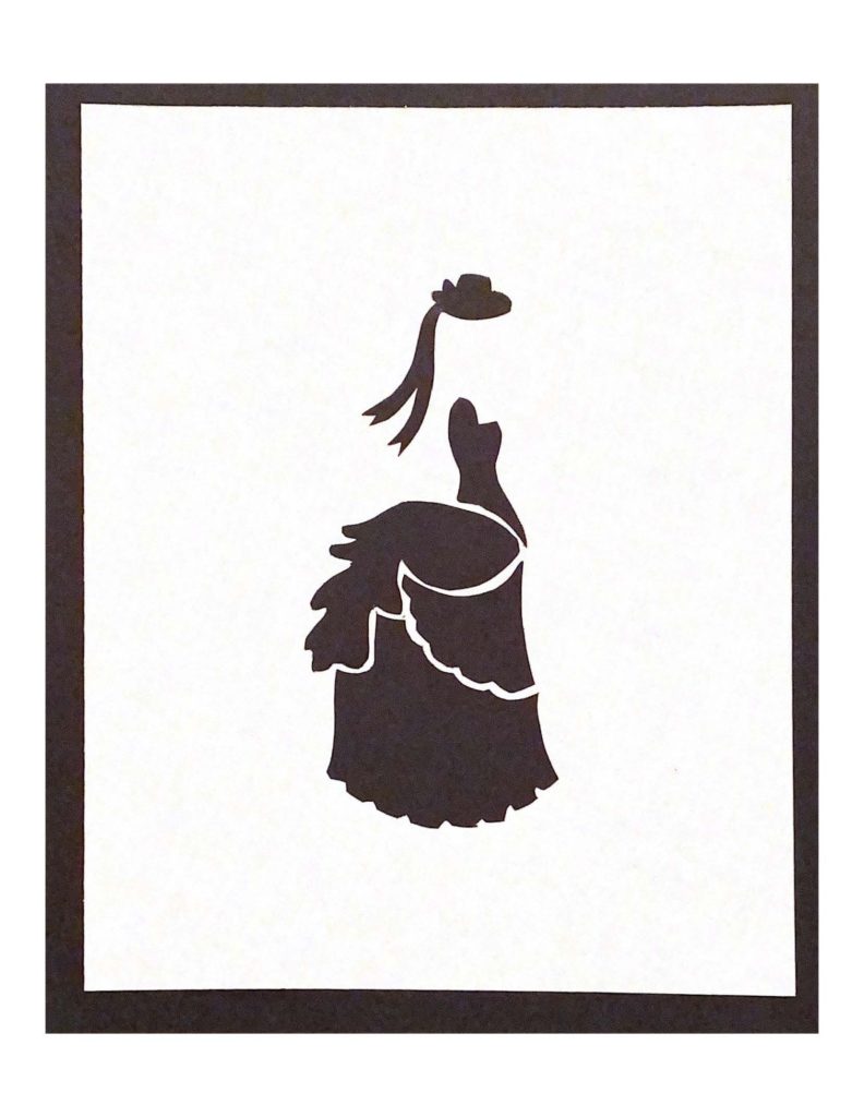
Your craftsmanship is great and I love the lava lamp solution. I’m a little confused by the top of solution II because I first see a face with a dripping tongue but I also see two figures standing shoulder-to-shoulder. I would also watch your placement of shapes on the page in-relation to the edge/each other. Solution III looks centered and it reads very well. Overall, good work!


These are all nicely crafted and designed. I’m assuming these are all glued down, so editing probably isn’t likely at this point but here are some thoughts:
1. I like that you kept a bulk of the square present and that there’s an interesting interplay between the two “characters” which are odd and playfully ambiguous (are they dandelions, rockets, hands – who knows?) It might have been interesting to play with a non-mirrored variation of the element outside of the box to see if the space could be better activated by spacing the remaining pieces out in a different way. So many possibilities.
2. This has nice graphic concision and playful shapes. The top and bottom elements are strong in design and placement, but the spilling vase element (?) feels a bit static. Still a very good piece for a challenging assignment.
3-4. These both feature great shape work, but I think the lava lamp has a better sense of scale. You also get a little reliant on central elements in the last three.
Overall an excellent effort!
Hi Lena!
Your craftsmanship is great and I love the lava lamp solution. I’m a little confused by the top of solution II because I first see a face with a dripping tongue but I also see two figures standing shoulder-to-shoulder. I would also watch your placement of shapes on the page in-relation to the edge/each other. Solution III looks centered and it reads very well. Overall, good work!