
Hi y’all, here are some of my ideas for the shape project. I would appreciate critical feedback and suggestions!
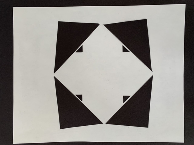
I) Idea for #1 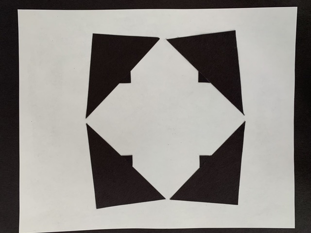
II) Idea for #1 
III) Idea for #2 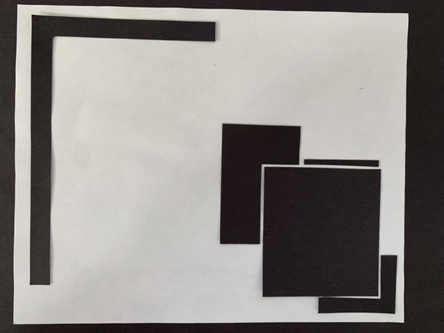
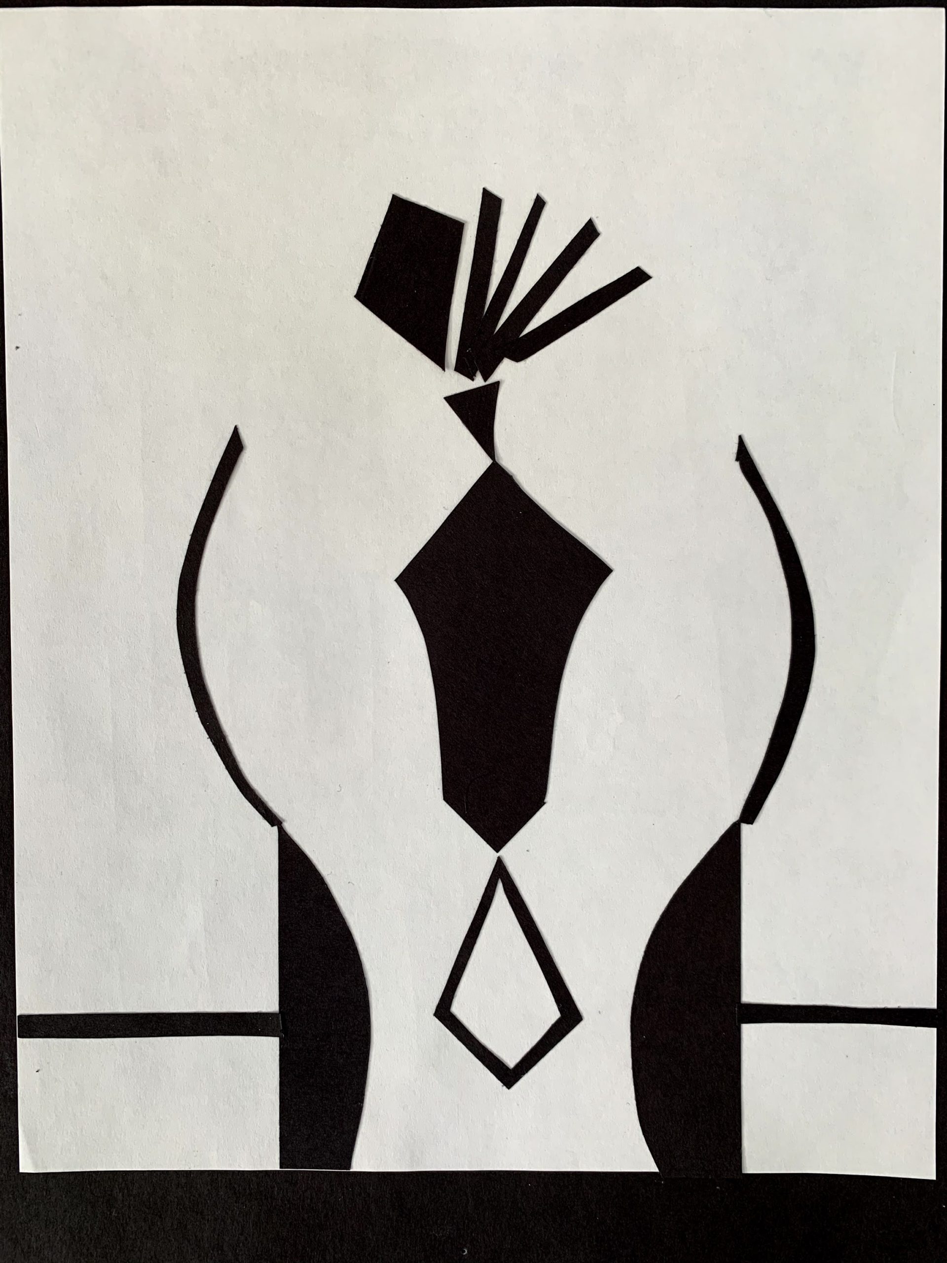
IV) Idea for #3 
V) Idea for #3 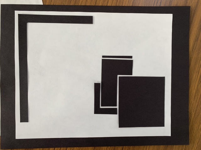
VI) Idea for #3
Hi y’all, here are some of my ideas for the shape project. I would appreciate critical feedback and suggestions!
You must be logged in to post a comment.
Love the square concept! (though I wish you could get a less distorted photo since I think a non-warped border would really aid the illusion created by the form – but we’re doing what we can under the circumstances)
I’m on the fence regarding which one is strongest since both have their merits and I’ll be curious to see what others say. I’m inclined to go with the vertical composition since it seems to aid the tension. And I think I prefer the gaps on the triangles in #1 (but in #2 they also really hold the square in place)
For #3 I would go with (V)
Still not feeling that balancing act on the top for idea #2.
Interesting concepts and I’m glad you played around with different solutions.
-While the 2nd idea for #1 feels like more of a perspective, I like the detail that separates the triangles from the larger shape.
-For #2, I’m confused what I’m looking at but I like that you’re really getting into abstract shapes. I feel like there is a lack of cohesion between the top lil bit and the rest of the composition. It’s pretty much mirrored up until that lil top part, are you doing that for a reason and if so, why? Keep playing with it just backup whatever you choose.
-V) I like #3 because of the little seat the box most centered is in – its a smaller version of the top. I would play with their spacing in relation to each other and the edge of the page
Overall, great job!