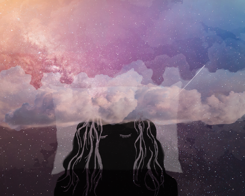
Lena – A lot of excess space in the composition, so I might like to see the drawn portrait element increased in scale to be more of a central focal point. A higher contrast approach might be better than the soft transparencies for graphic appeal. Happy to review this with you via screen share during class if you’d like.

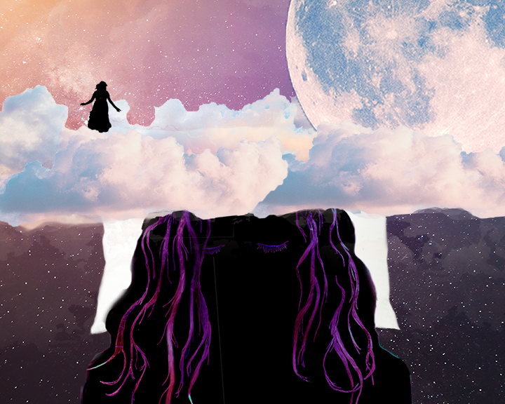

Lena – A lot of excess space in the composition, so I might like to see the drawn portrait element increased in scale to be more of a central focal point. A higher contrast approach might be better than the soft transparencies for graphic appeal. Happy to review this with you via screen share during class if you’d like.