
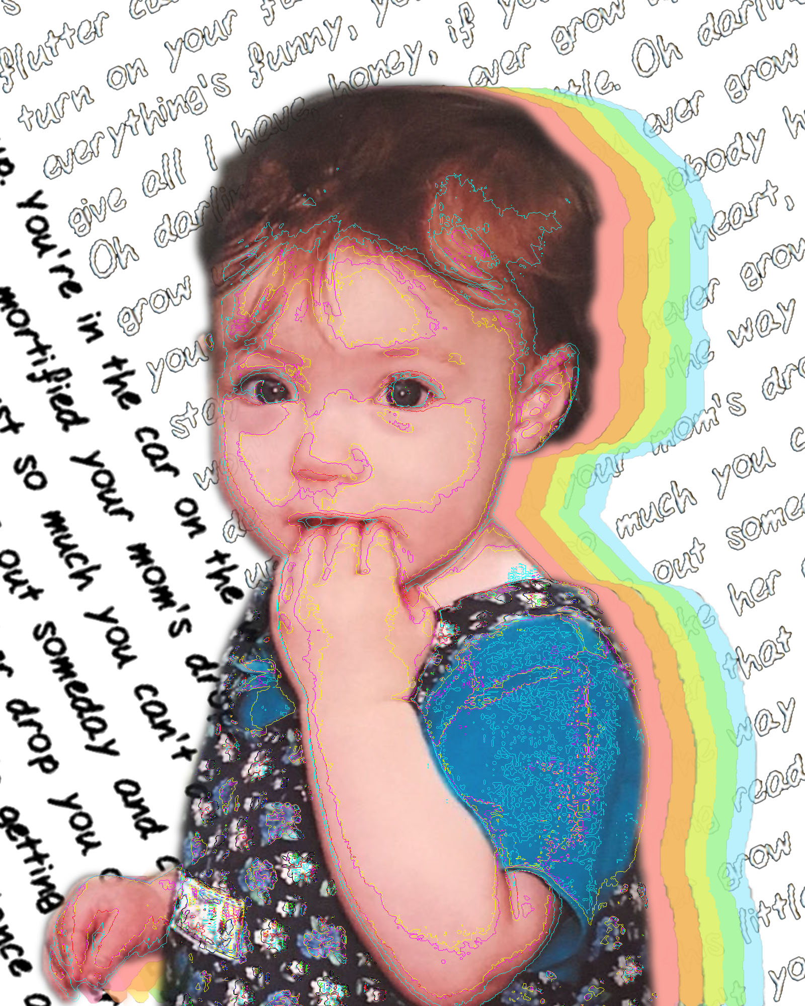
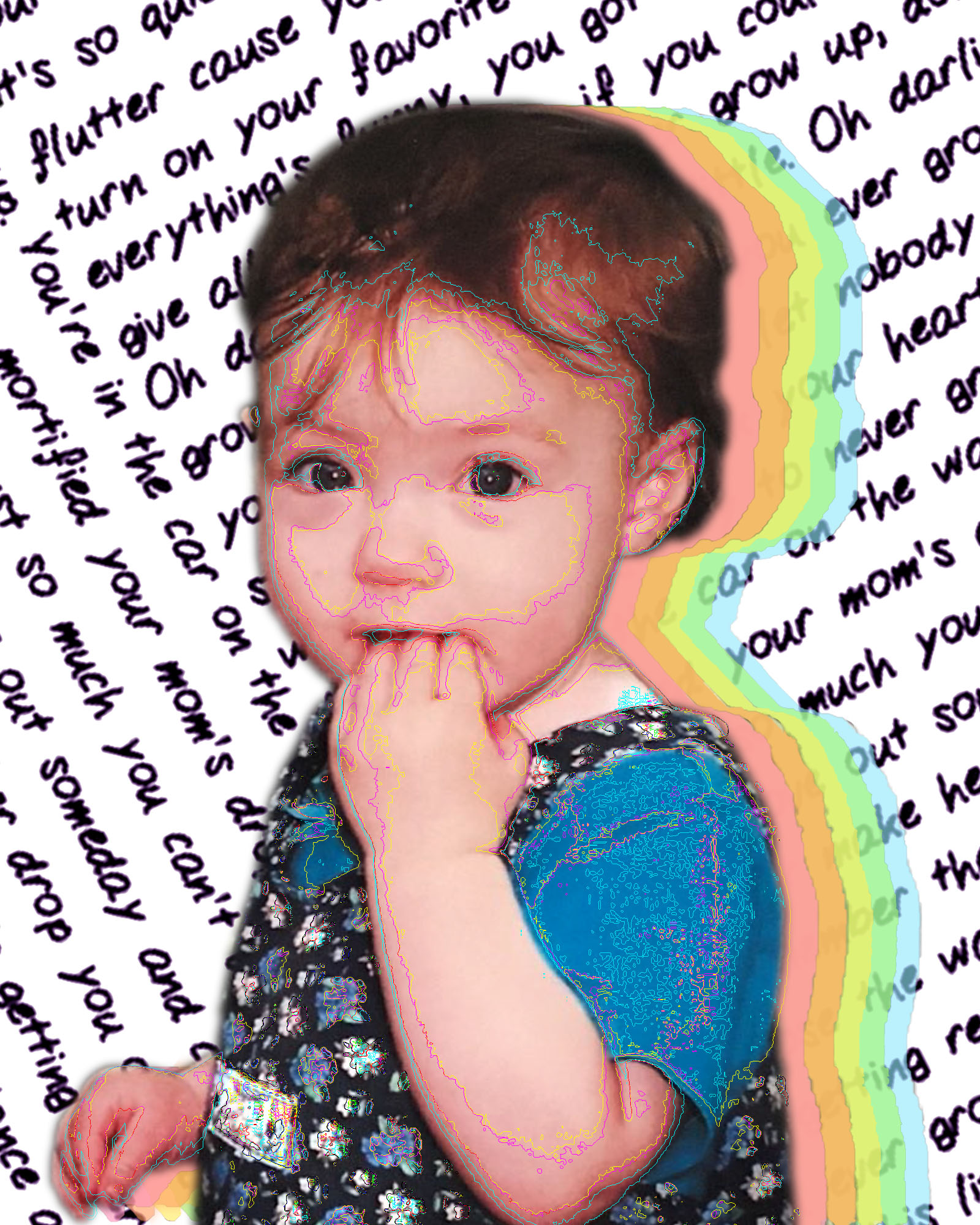
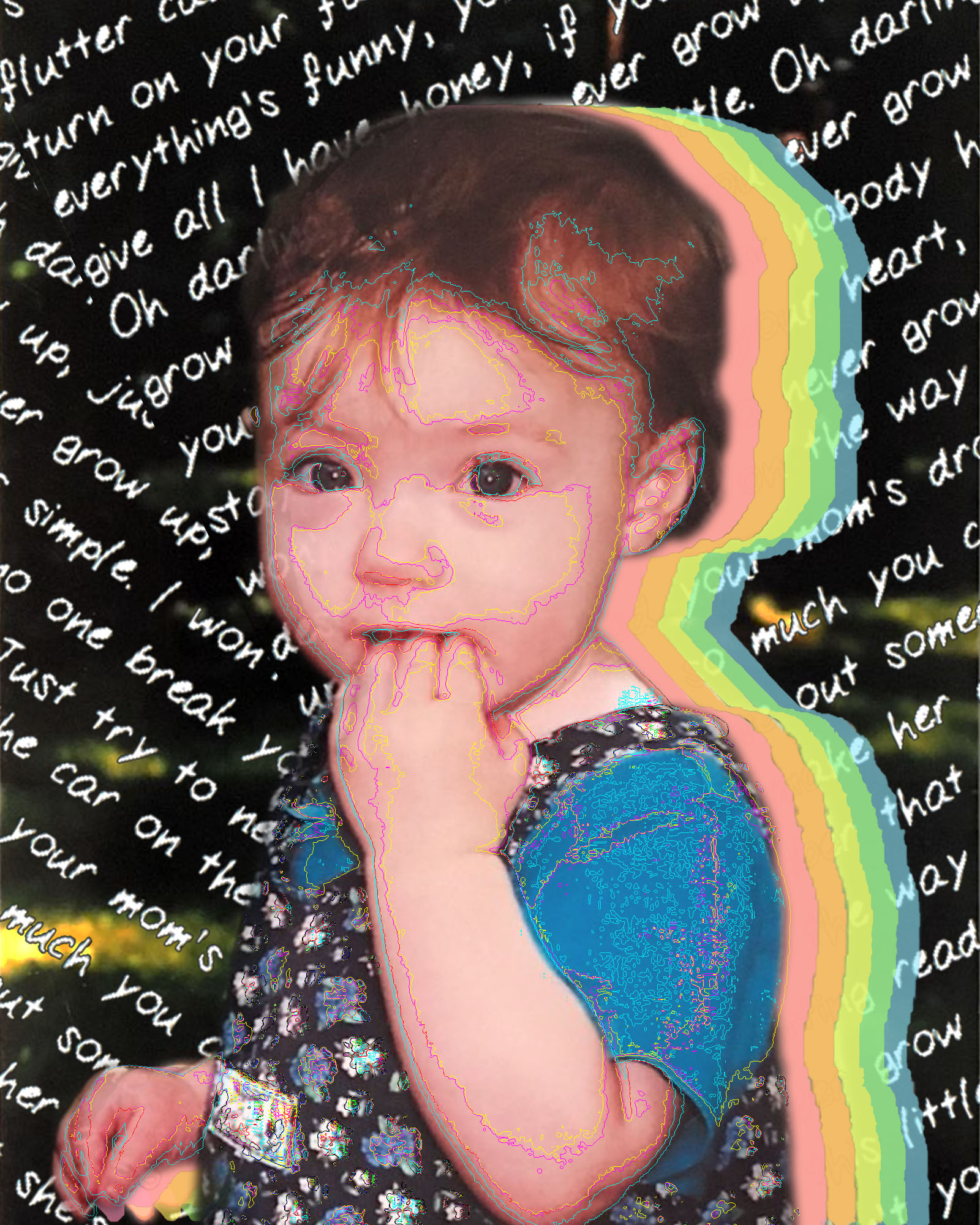
I won’t be able to talk with you about the piece on zoom tonight because I have a meeting I have to go to, but any feedback in the comments would be appreciated. Thank you!!
One thought on “Self Portrait (second draft)”
Leave a Reply
You must be logged in to post a comment.
These are much stronger compositionally and have better graphic cohesion of elements. I don’t care for the outlined type in #1, but I’m torn between the black and white background in #2 & 3. The type construction works better with the perpendicular arrangement in #2. I just might like to see the opacity reduced in the type or a colorization to a lighter color so it’s not so visually heavy. Nice work!