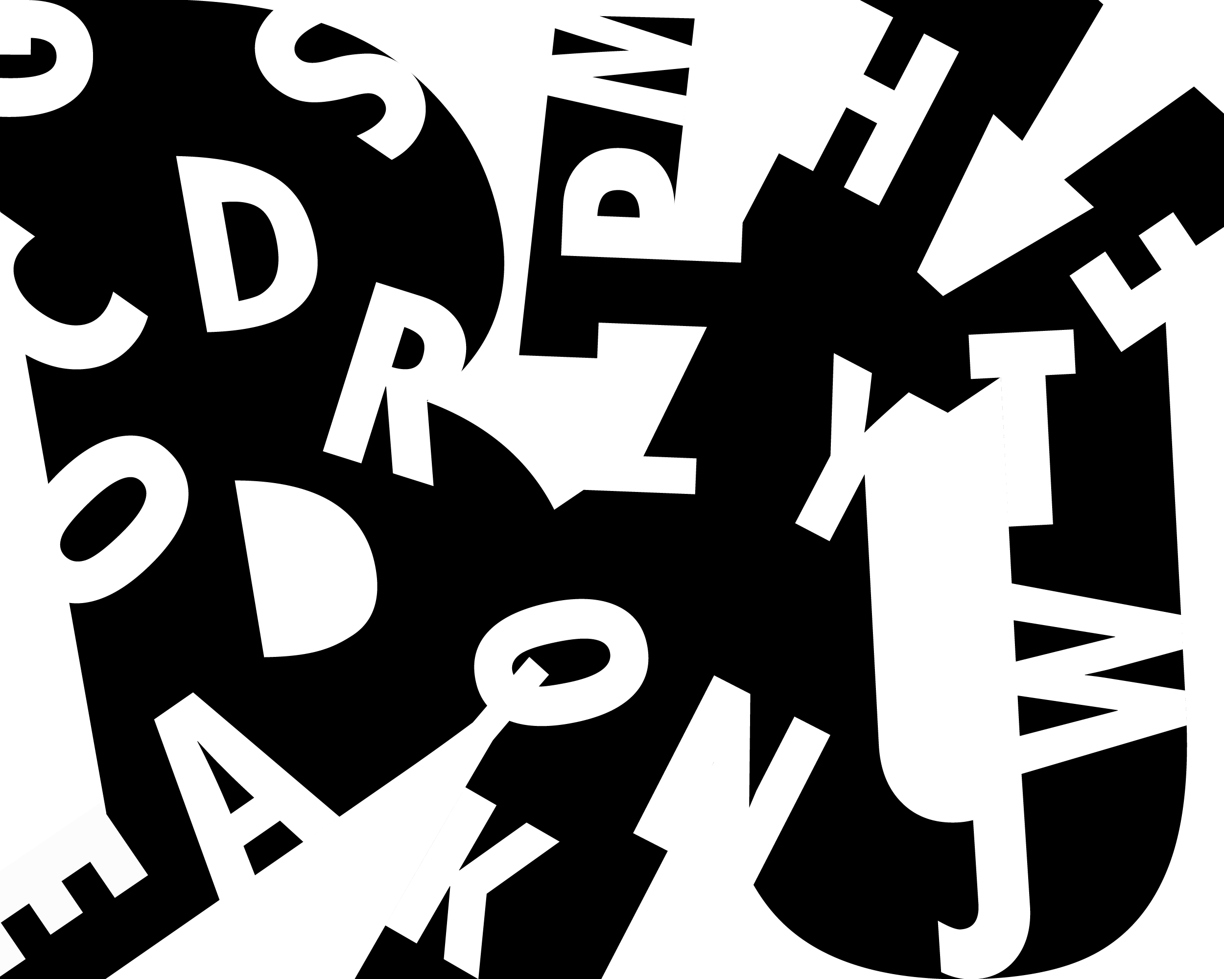
Love the lively animation of the design and the thoughtful subtractive decisions. Also enjoy the perspective created in the upper right and lower left with the diagonals. There are only a few letters I might tweek a bit: the letters in the upper left (C,D,O,R) feel a bit too orderly, so maybe consider some subtle rotations so they have a similar vibe to those on the right side of the composition.
I would also try to avoid having any letters being perfectly perpendicular (like the Z).
I really like how bold your piece is. You have a great background-foreground reversal, so my eye is drawn to a lot of different places. Like Jason said, it feels very animated and lively. My favorite part is the D inside the cut out of the B, it is a very creative way to compose the letters.


Love the lively animation of the design and the thoughtful subtractive decisions. Also enjoy the perspective created in the upper right and lower left with the diagonals. There are only a few letters I might tweek a bit: the letters in the upper left (C,D,O,R) feel a bit too orderly, so maybe consider some subtle rotations so they have a similar vibe to those on the right side of the composition.
I would also try to avoid having any letters being perfectly perpendicular (like the Z).
Nice work!
I really like how bold your piece is. You have a great background-foreground reversal, so my eye is drawn to a lot of different places. Like Jason said, it feels very animated and lively. My favorite part is the D inside the cut out of the B, it is a very creative way to compose the letters.