Love the sense of scale and structure in the upside down Y composition. Play around with the integration of the remaining letters on the bottom and perhaps reduce scale to give the form a larger architectural read. Log in to Reply
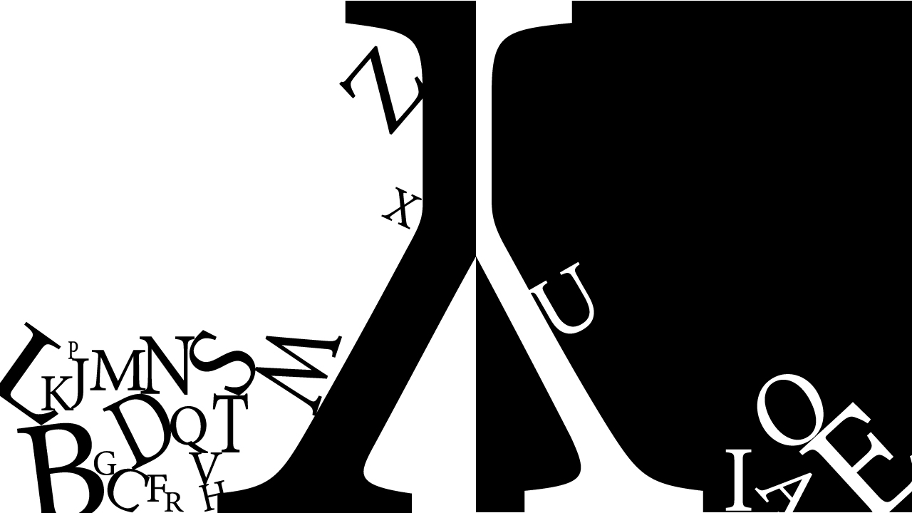
Maybe lose the tumbling letters and focus on more of a tension arrangement of the letters (like you did with the O and E on the lower right corner) Log in to Reply


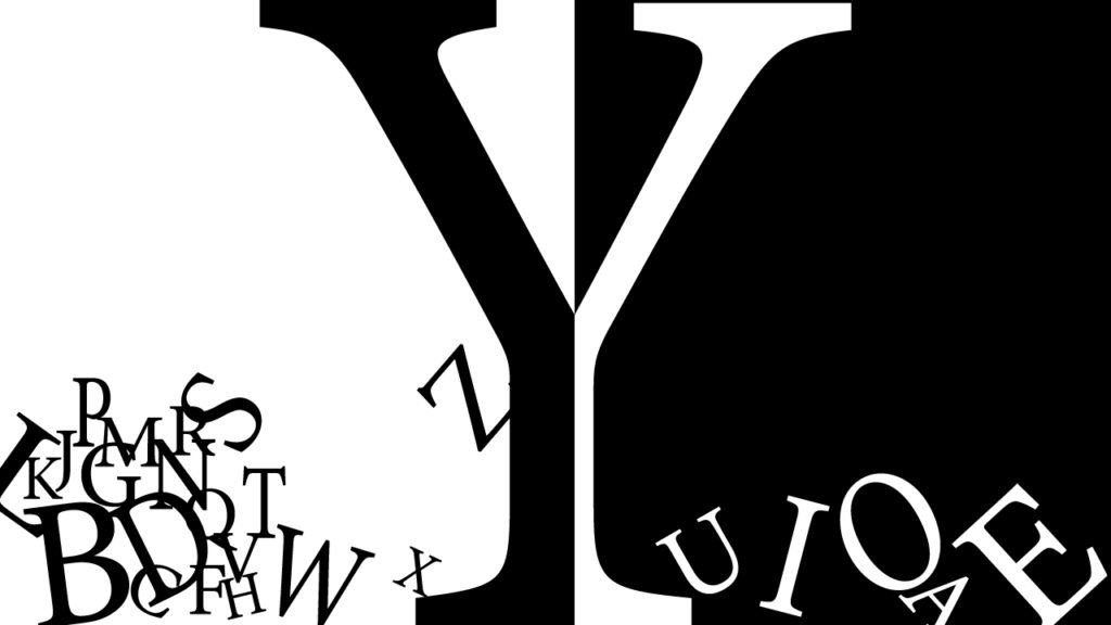

Love the sense of scale and structure in the upside down Y composition. Play around with the integration of the remaining letters on the bottom and perhaps reduce scale to give the form a larger architectural read.
Maybe lose the tumbling letters and focus on more of a tension arrangement of the letters (like you did with the O and E on the lower right corner)