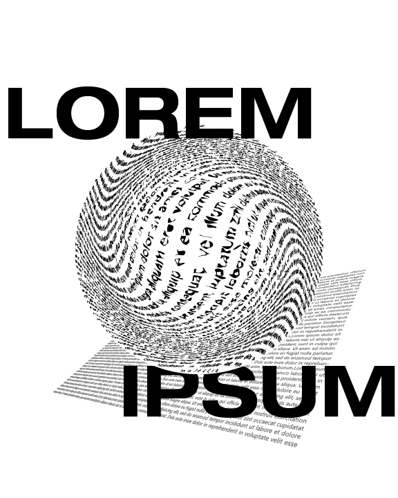
Love the sense of form and value you have created with the area type. The warped rectangle serves as a nice base that allows the sphere to have some spatial interaction.
The LOREM IPSUM type is a bit heavy handed and detracts from the delicacy of the other constructions (it does have a bit of a theatrical quality – like a Saul Bass animated title)
I might like see you try something a bit more subtle (like a background fill with very small type with a light value – or maybe a containment/border element. I’ll send you a screenshot for reference.
Overall some nice design work.
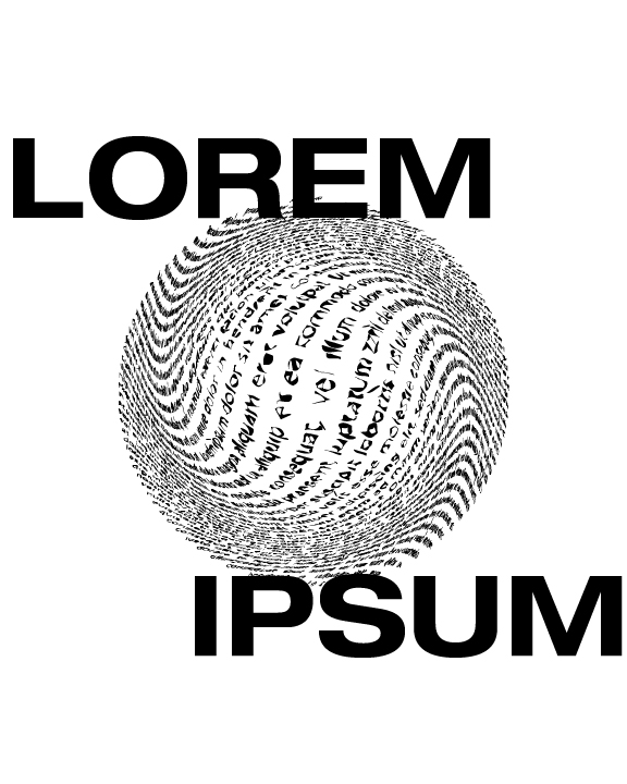