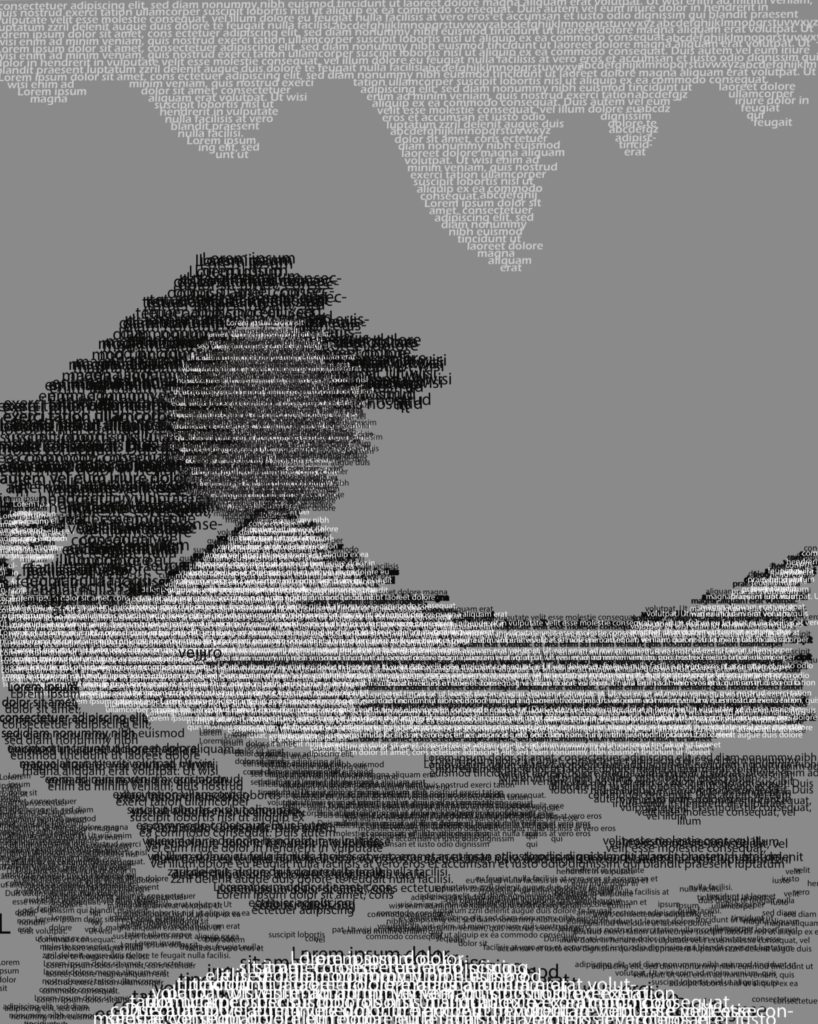
An intriguing textural approach that could use better value contrast. Some of the layering creates a “double-vision effect” so I prefer the single value approach you used at the top. I would also like to see random generated type rather than the default lorem ipsum text.
It’s clear that this a landscape image, and at first I thought it might be inspired by Hokusai’s wave. However, the dark element beyond the mountains is a bit confusing.
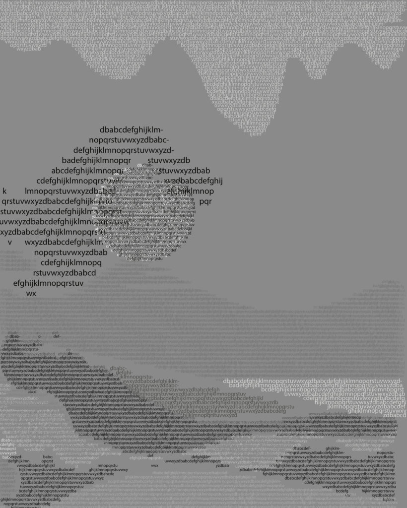
More clarity but still some issues with contrast. Perhaps you can try versions with different values applied.
I think the middle-value background is challenging for the contrast, so maybe try one on white or black.
Or try lightening all of the text values on this one.
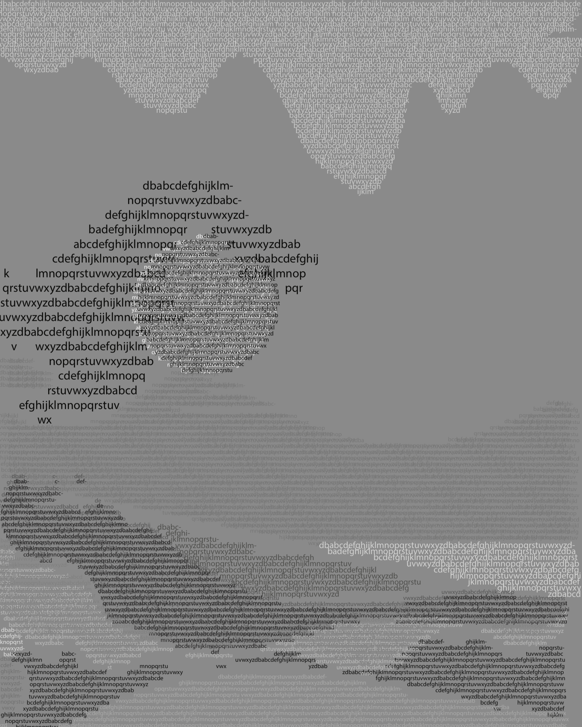
The curl on the wave still bothers me, so maybe try reducing the scale on the type and not using black.
Wow! There is so much work put into this piece. I can definitely tell you based it on Hokusai’s wave. I love how you used different values in the letters to create depth. Like Jason said, the middle value is getting lost in the background value, but that’s the only value I have an issue with. I’m very impressed by the detail put into this.


An intriguing textural approach that could use better value contrast. Some of the layering creates a “double-vision effect” so I prefer the single value approach you used at the top. I would also like to see random generated type rather than the default lorem ipsum text.
It’s clear that this a landscape image, and at first I thought it might be inspired by Hokusai’s wave. However, the dark element beyond the mountains is a bit confusing.
Yeah, it actually is inspired by Hokusai’s wave, I just didn’t want it to be too representational. I tried to declutter it in the second draft though.
More clarity but still some issues with contrast. Perhaps you can try versions with different values applied.
I think the middle-value background is challenging for the contrast, so maybe try one on white or black.
Or try lightening all of the text values on this one.
The curl on the wave still bothers me, so maybe try reducing the scale on the type and not using black.
Wow! There is so much work put into this piece. I can definitely tell you based it on Hokusai’s wave. I love how you used different values in the letters to create depth. Like Jason said, the middle value is getting lost in the background value, but that’s the only value I have an issue with. I’m very impressed by the detail put into this.