The black letter composition is on the right track. Some interesting negative shapes starting to form, particularly in the central section. Some of the other small letters don’t integrate as well, so consider using white letters to subtract from the design instead (see Cole’s composition in the blog for reference)
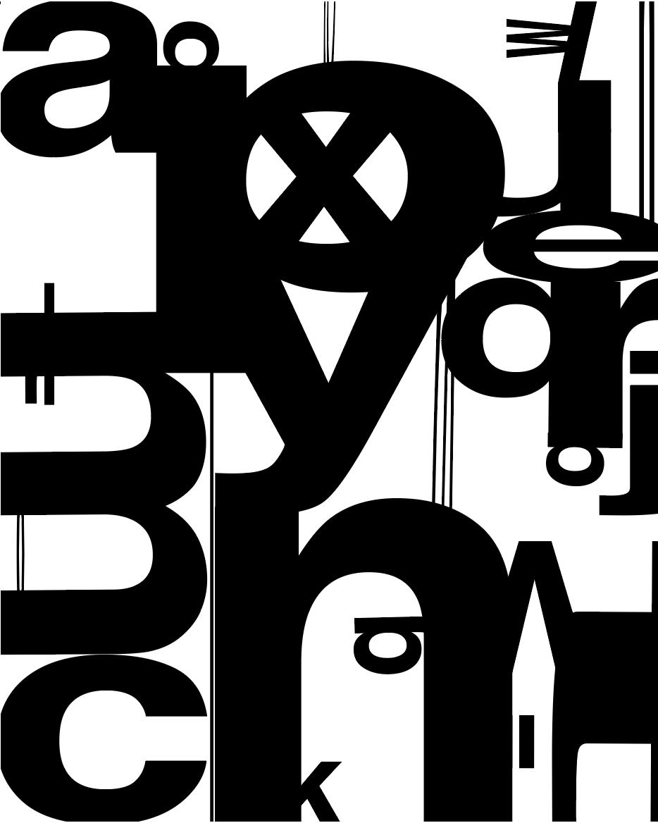
I like the delicate grays in the second design but the composition isn’t as strong yet.


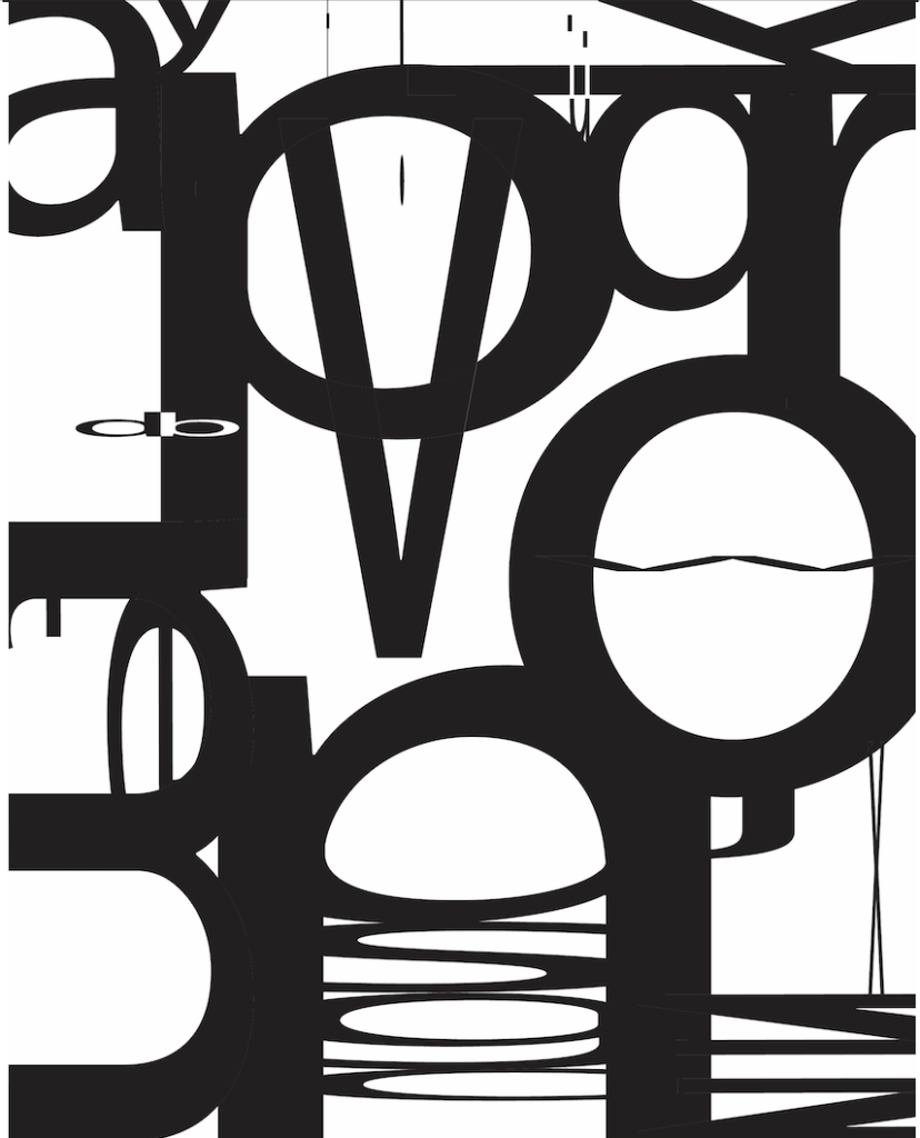


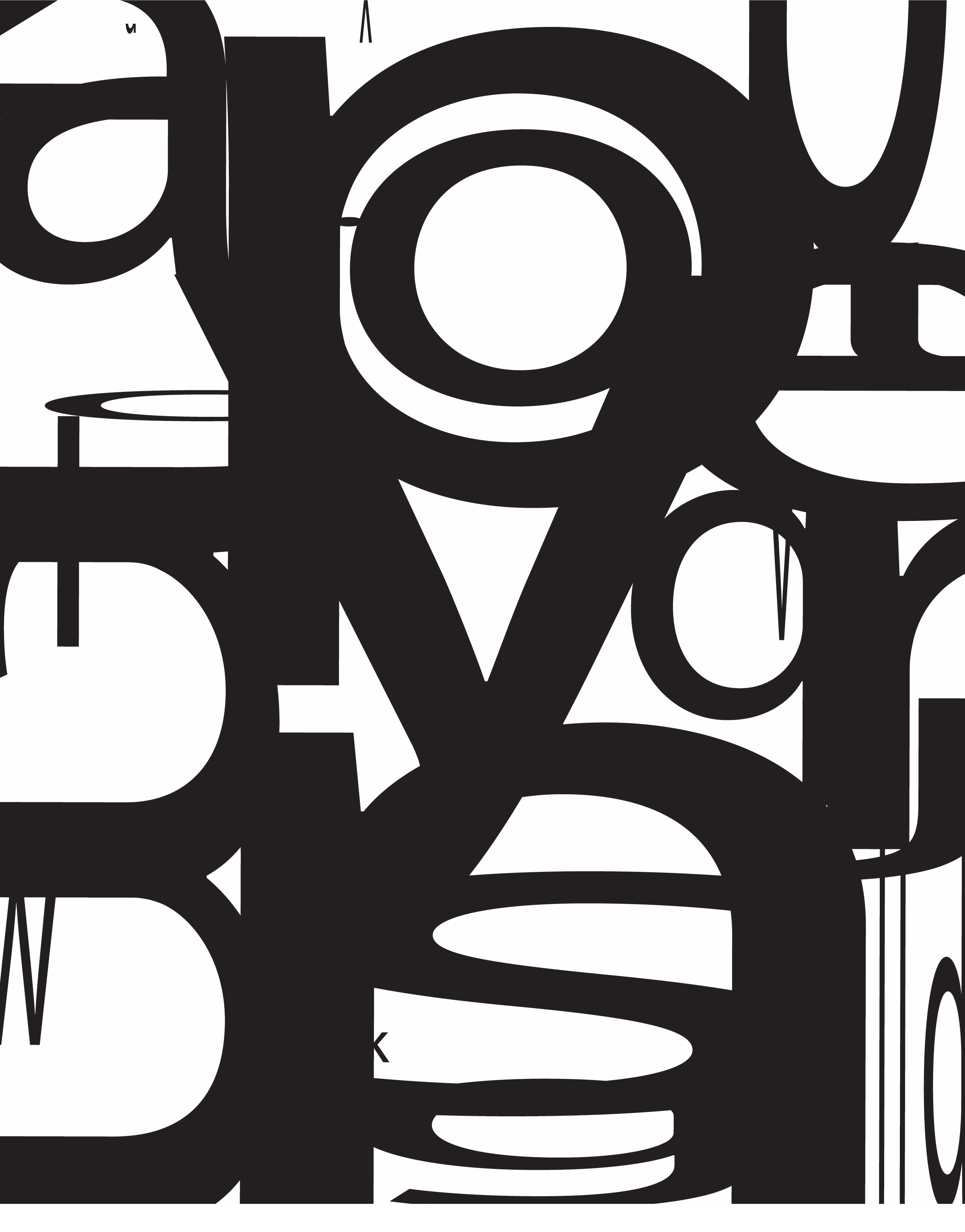
The black letter composition is on the right track. Some interesting negative shapes starting to form, particularly in the central section. Some of the other small letters don’t integrate as well, so consider using white letters to subtract from the design instead (see Cole’s composition in the blog for reference)
I like the delicate grays in the second design but the composition isn’t as strong yet.