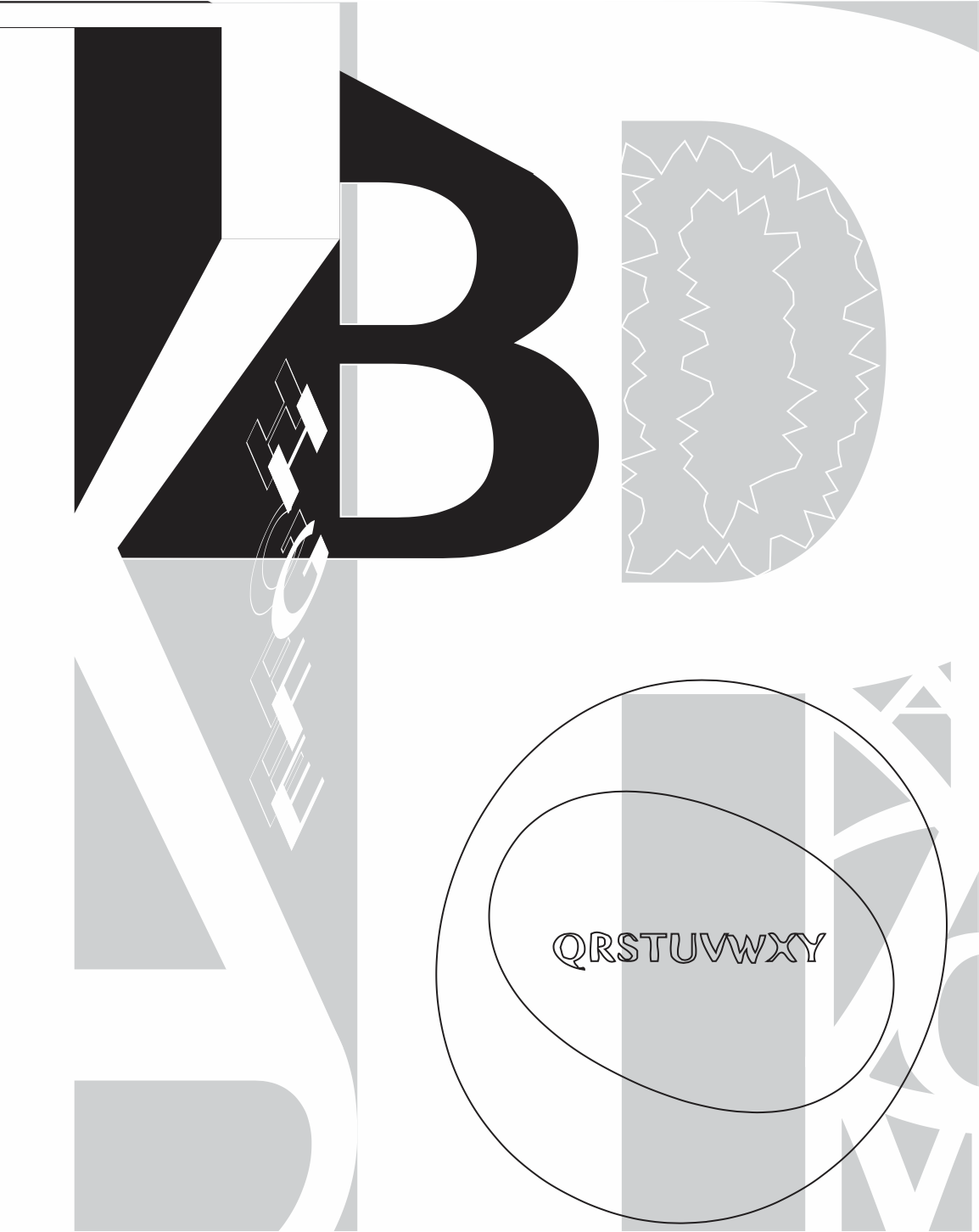
I’m glad ot see you had some fun with the vector effects on these. Compositionally, the gray and white one with no effects is the strongest though. Love the subdivisions in the piece, but I’d like to see better integration of Q>Y and perhaps different handling of the stroke-only elements.


I’m glad ot see you had some fun with the vector effects on these. Compositionally, the gray and white one with no effects is the strongest though. Love the subdivisions in the piece, but I’d like to see better integration of Q>Y and perhaps different handling of the stroke-only elements.