These have good economy but are a little bland. V has the most graphic impact, but perhaps you can try various ways to integrate the smaller letters. (maybe one where they appear flush under the base and one where they are used subtractively inside the W along the same edge.
The LW integration in IV might work better if you enlarge it to bleed off the page and subdivide the ground rather than float it in the center.
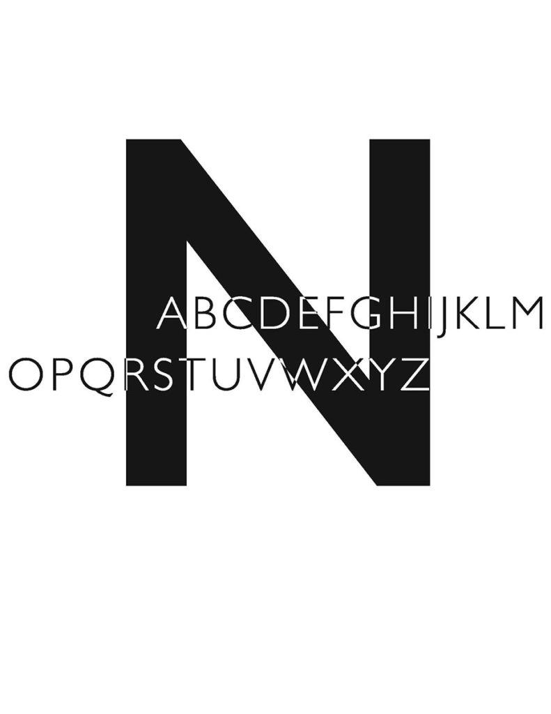
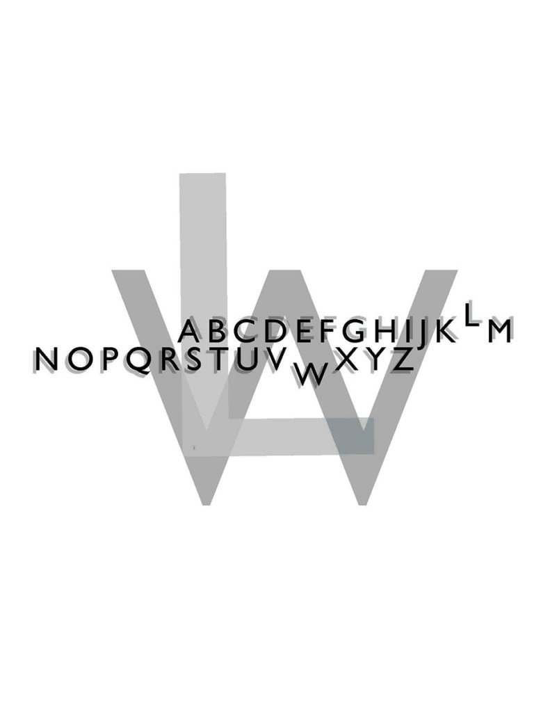
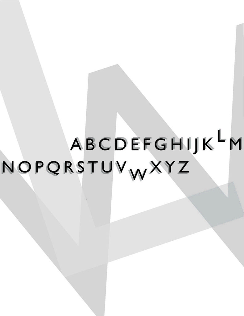
Thank you! I have made some changes and would love some additional feedback if possible.
I sent a bunch of rough Pshop edits via email for some compositional ideas.