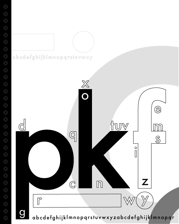
I really enjoy the dark solid letters in the front contrasting with the lighter value in the background. The stroke is nice on the small letters, but it could be heavier on the bigger letters like the F and the i. You have a good composition and it reminds me of one of those children’s books where you learn how to write the alphabet.

I really enjoy the dark solid letters in the front contrasting with the lighter value in the background. The stroke is nice on the small letters, but it could be heavier on the bigger letters like the F and the i. You have a good composition and it reminds me of one of those children’s books where you learn how to write the alphabet.