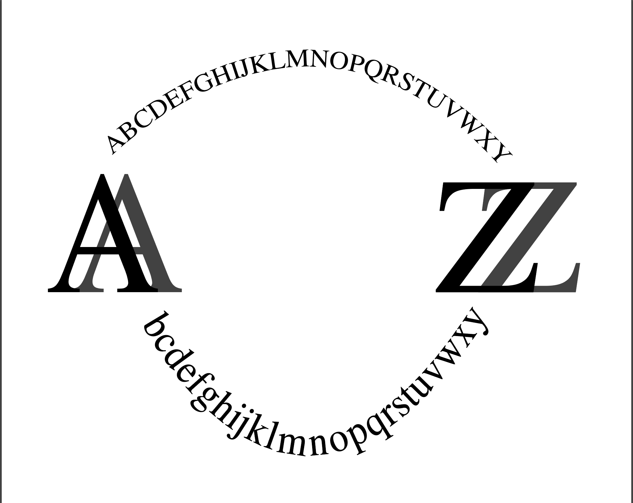
At first glance, I’m reminded of the amazon logo and how there is a line spanning from A-Z.. I like your concept of using both capital and lowercase letters and having a shadow on the A and Z. I wonder how it would look if you made the arch on the lowercase letters less dramatic and more like the capital letters.

At first glance, I’m reminded of the amazon logo and how there is a line spanning from A-Z.. I like your concept of using both capital and lowercase letters and having a shadow on the A and Z. I wonder how it would look if you made the arch on the lowercase letters less dramatic and more like the capital letters.