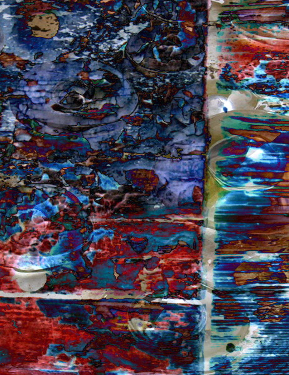
Some great texture and color. I look forward to hearing about the source images. Series II has the most graphic clarity and all three have different strengths. I think the color works best in the II:III. The project tends to generate lots of murky and busy compositions, so this one is very refreshing. II:I has the best form and also good contrast, but it might be interesting to brighten it up with levels just a bit. II:I feels very organic – like a microscope image. Feel free to try some alternate crops that break the 8 x 10 (square etc.)

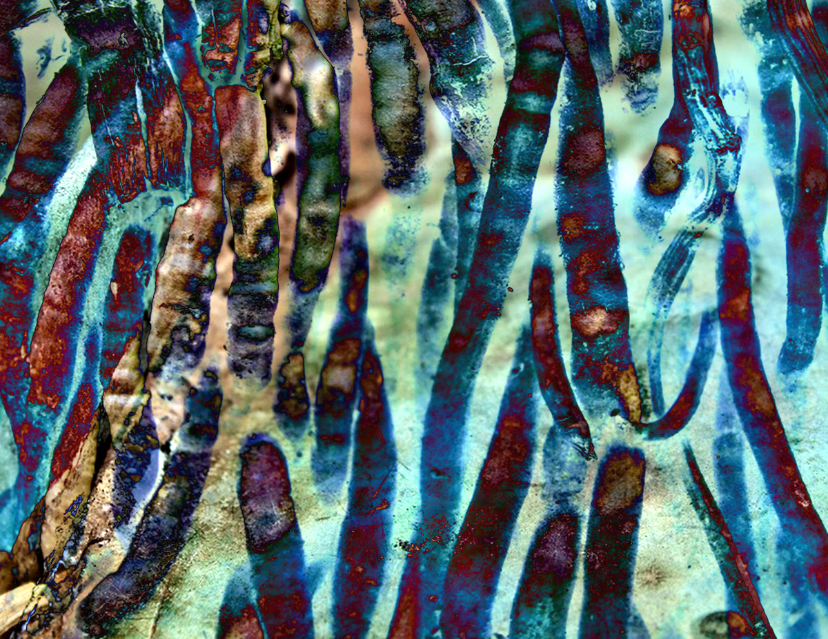

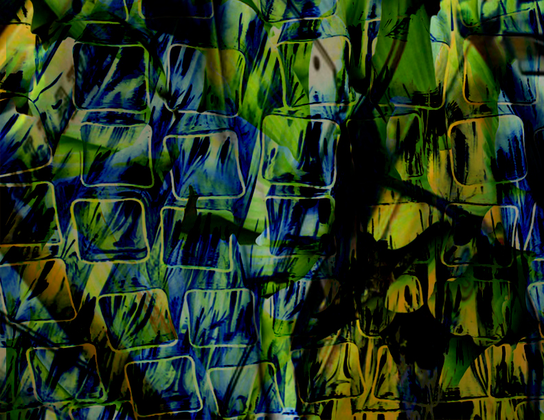


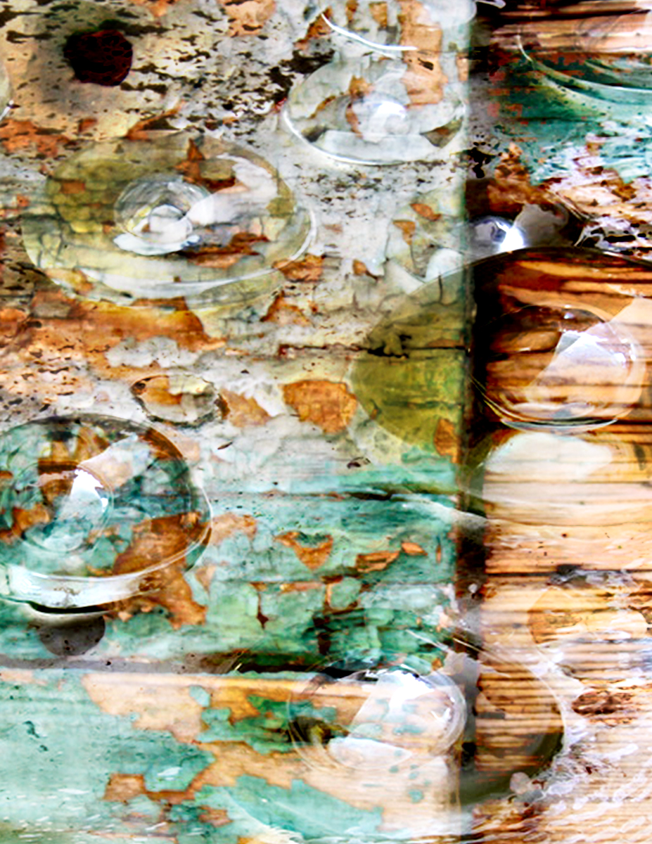
Some great texture and color. I look forward to hearing about the source images. Series II has the most graphic clarity and all three have different strengths. I think the color works best in the II:III. The project tends to generate lots of murky and busy compositions, so this one is very refreshing. II:I has the best form and also good contrast, but it might be interesting to brighten it up with levels just a bit. II:I feels very organic – like a microscope image. Feel free to try some alternate crops that break the 8 x 10 (square etc.)