One thought on “Digital Texture Project (progression)”
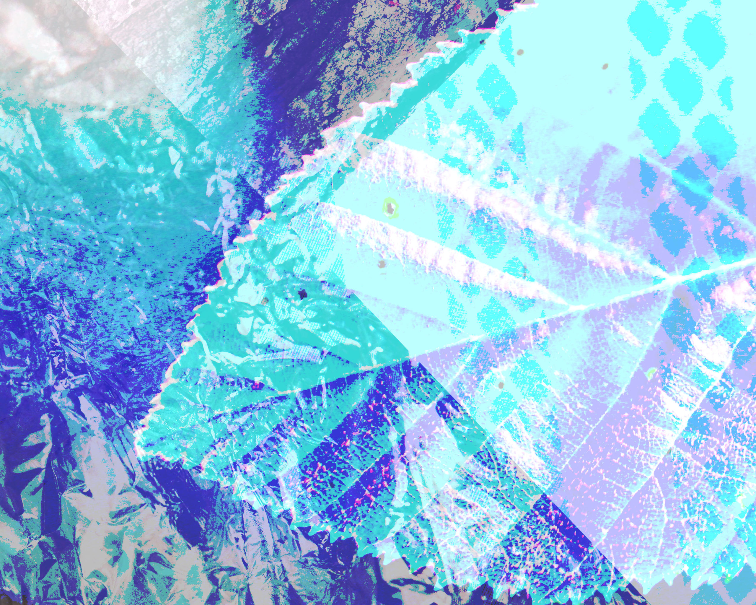
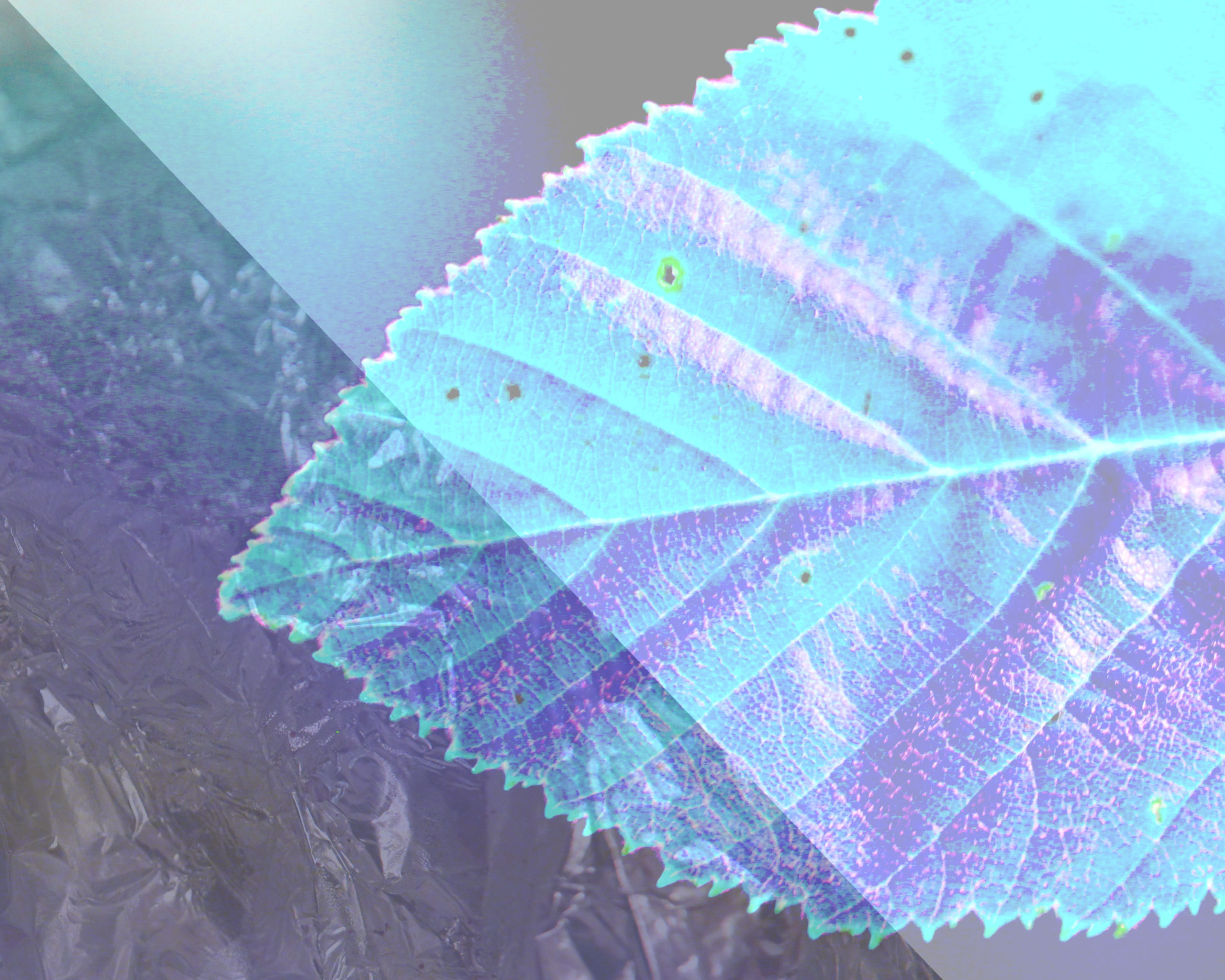
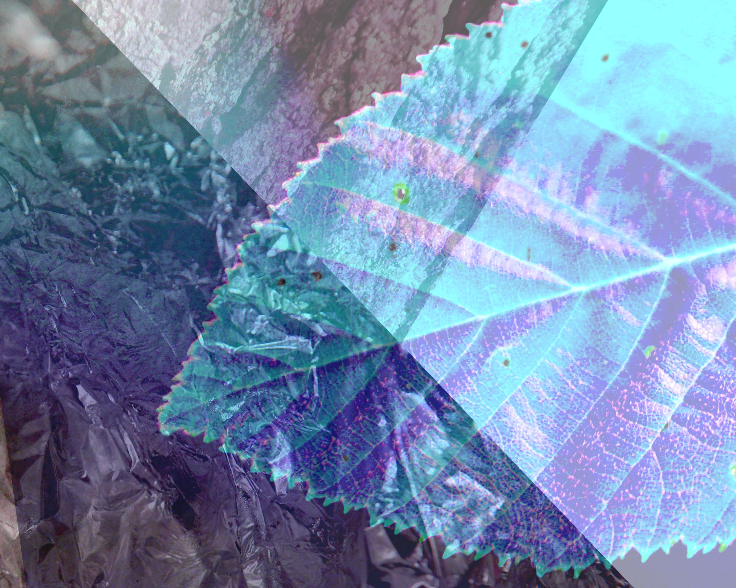
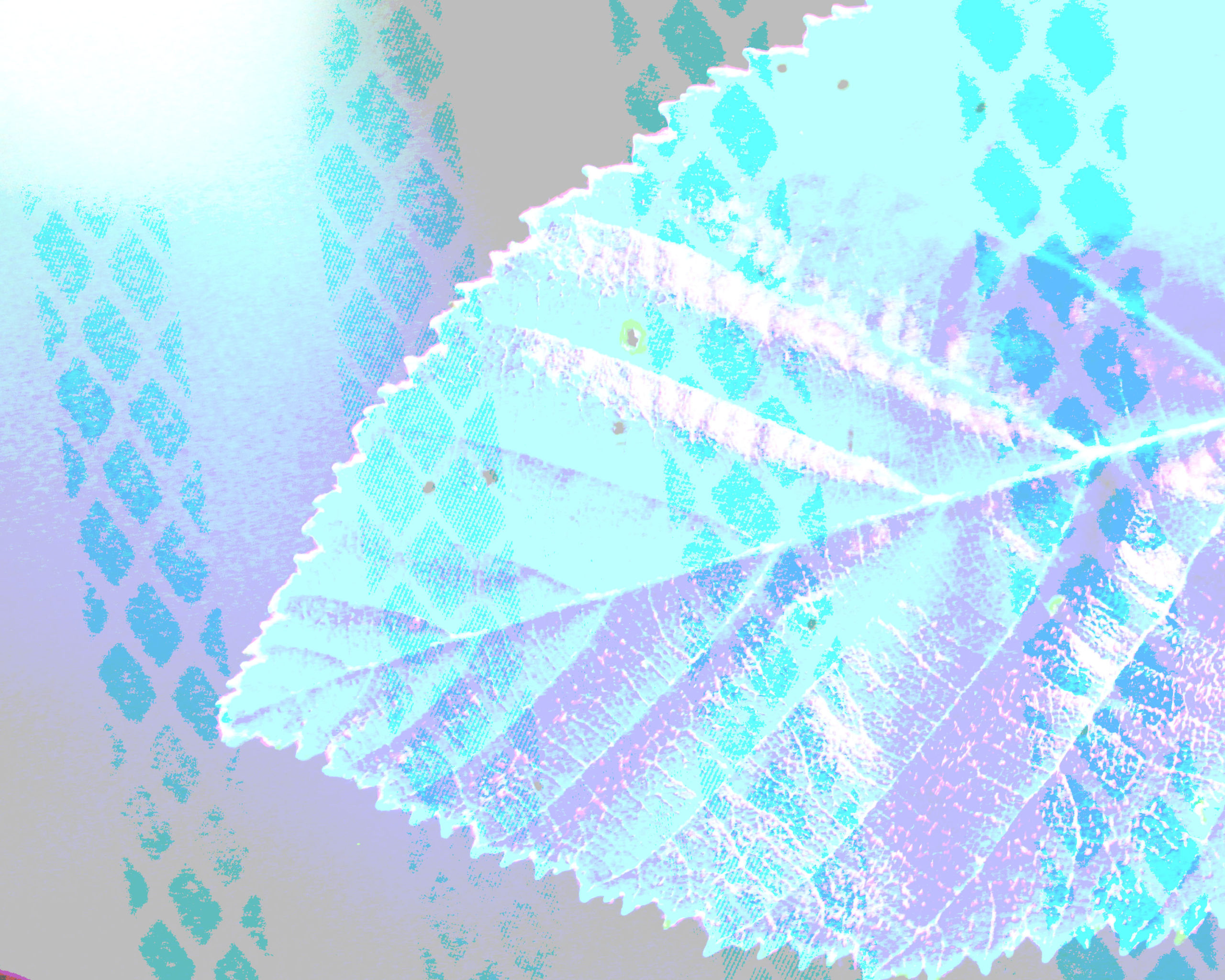
Some cool textures, but a lot of criss-crossing with the overlapping geometry and blending modes. The one without (4th down on the left) is most graphically concise and I like the burst of light in the upper left corner
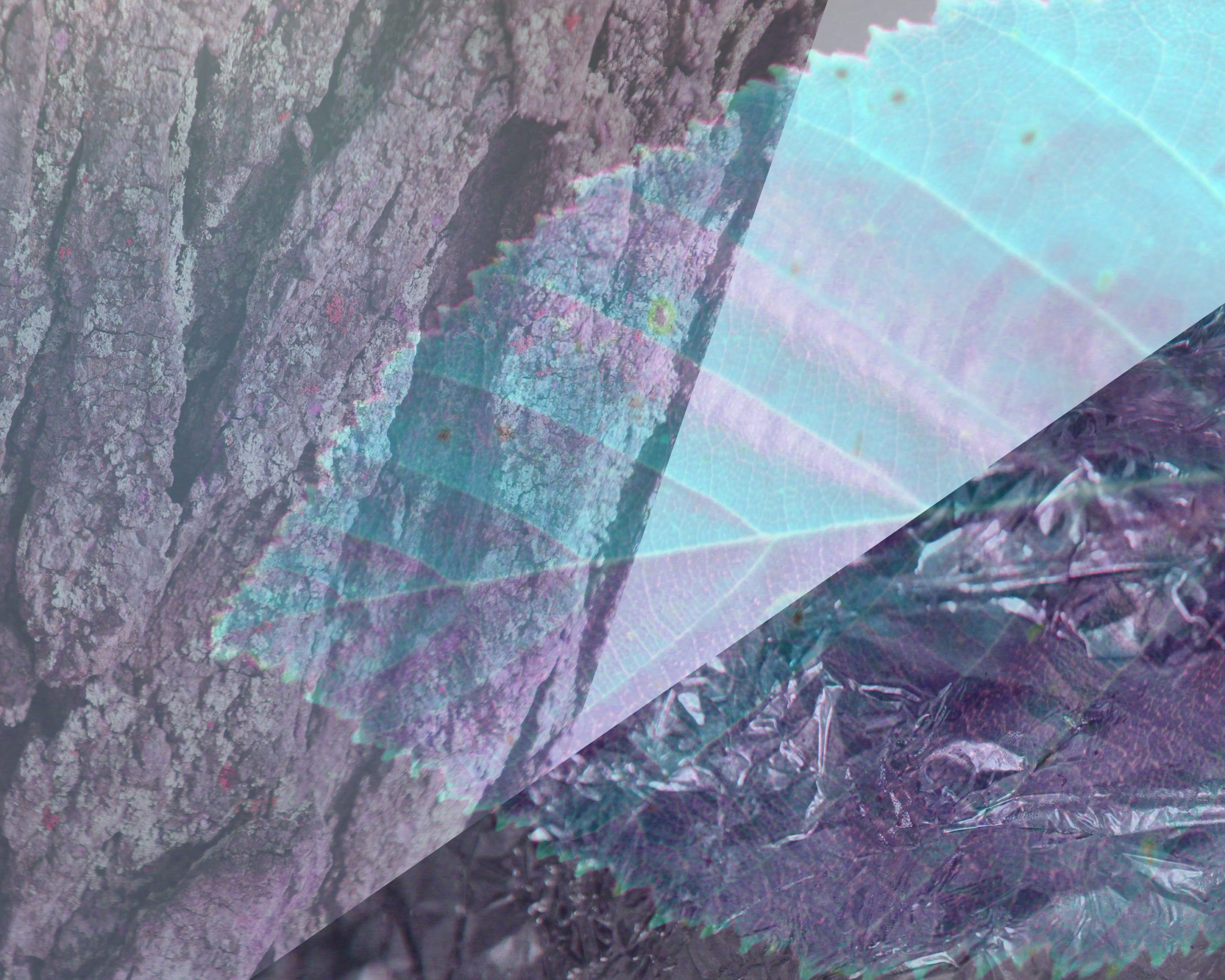
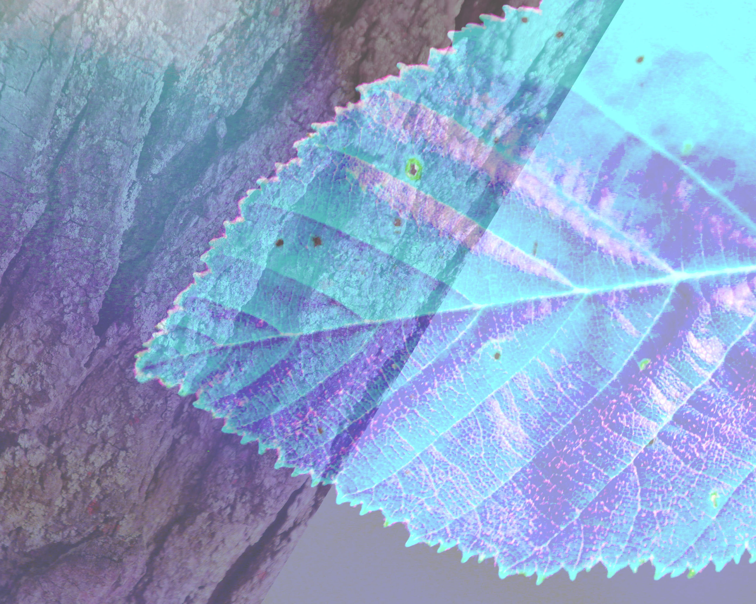
I think there is some interesting potential for the tree bark or foil to read as more of a horizon line for a landscape feel (see some of Evelyn’s alternates on the blog) if you use it to anchor the bottom of the composition and don’t rotate it quite as drastically. The tree bark in particular has a nice depth of field that lends itself to an intriguing spatial read.
Another approach might be to go all-in with the geometric approach (like the wedge in the upper right design) and fracture the composition without the overlapping of elements


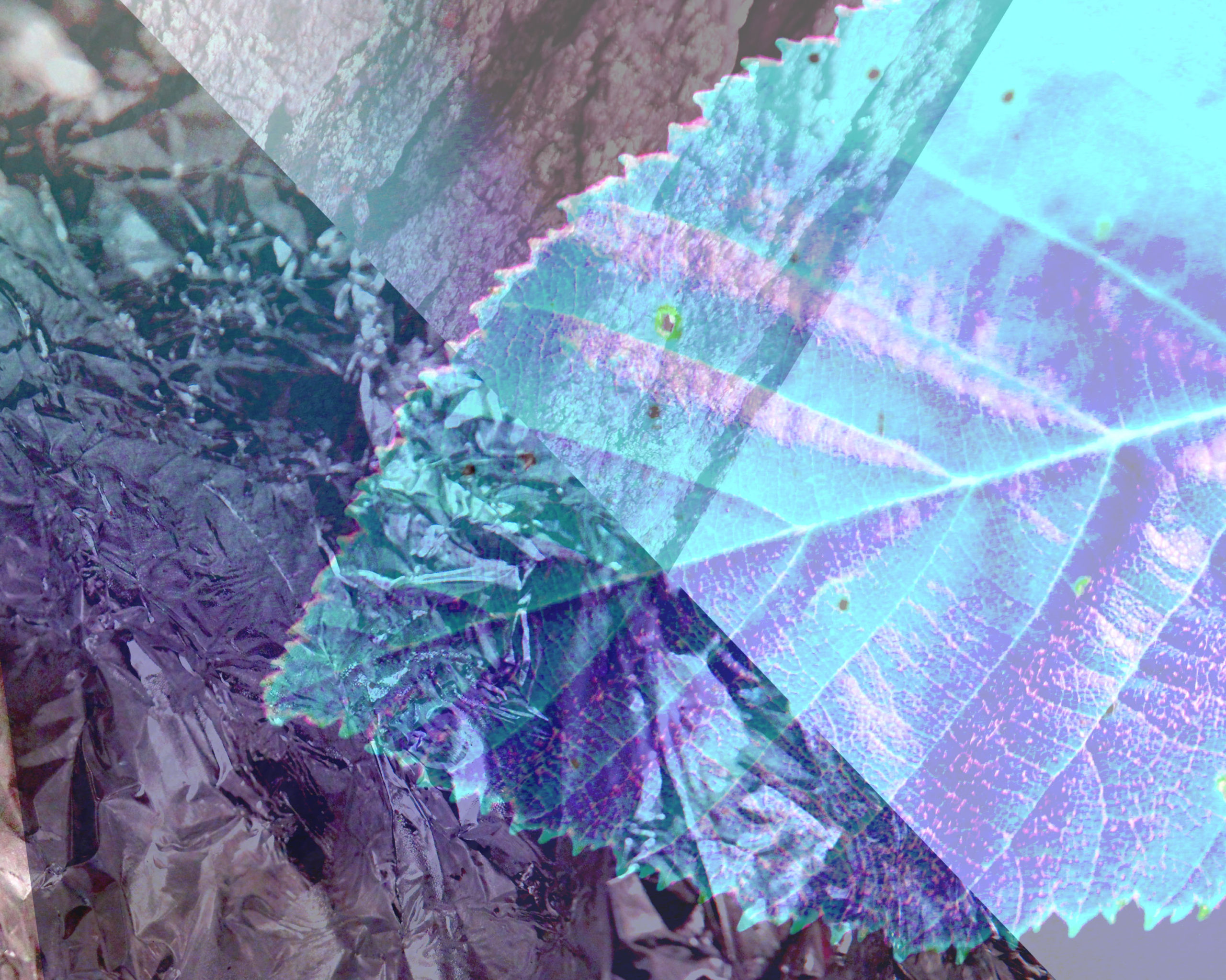
Some cool textures, but a lot of criss-crossing with the overlapping geometry and blending modes. The one without (4th down on the left) is most graphically concise and I like the burst of light in the upper left corner
I think there is some interesting potential for the tree bark or foil to read as more of a horizon line for a landscape feel (see some of Evelyn’s alternates on the blog) if you use it to anchor the bottom of the composition and don’t rotate it quite as drastically. The tree bark in particular has a nice depth of field that lends itself to an intriguing spatial read.
Another approach might be to go all-in with the geometric approach (like the wedge in the upper right design) and fracture the composition without the overlapping of elements