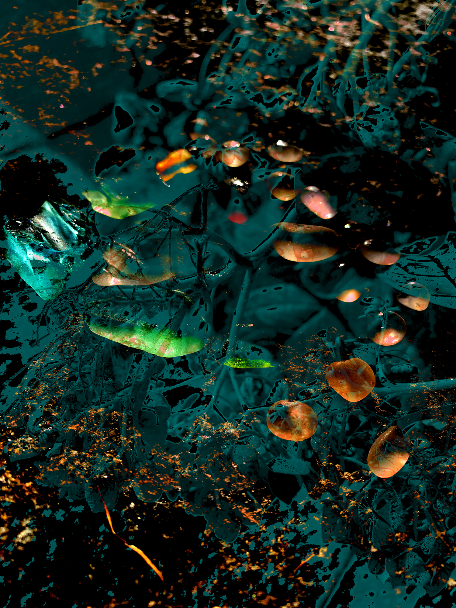
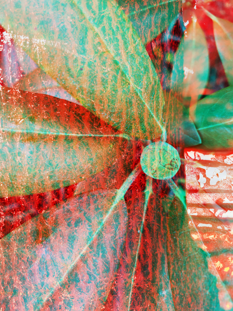
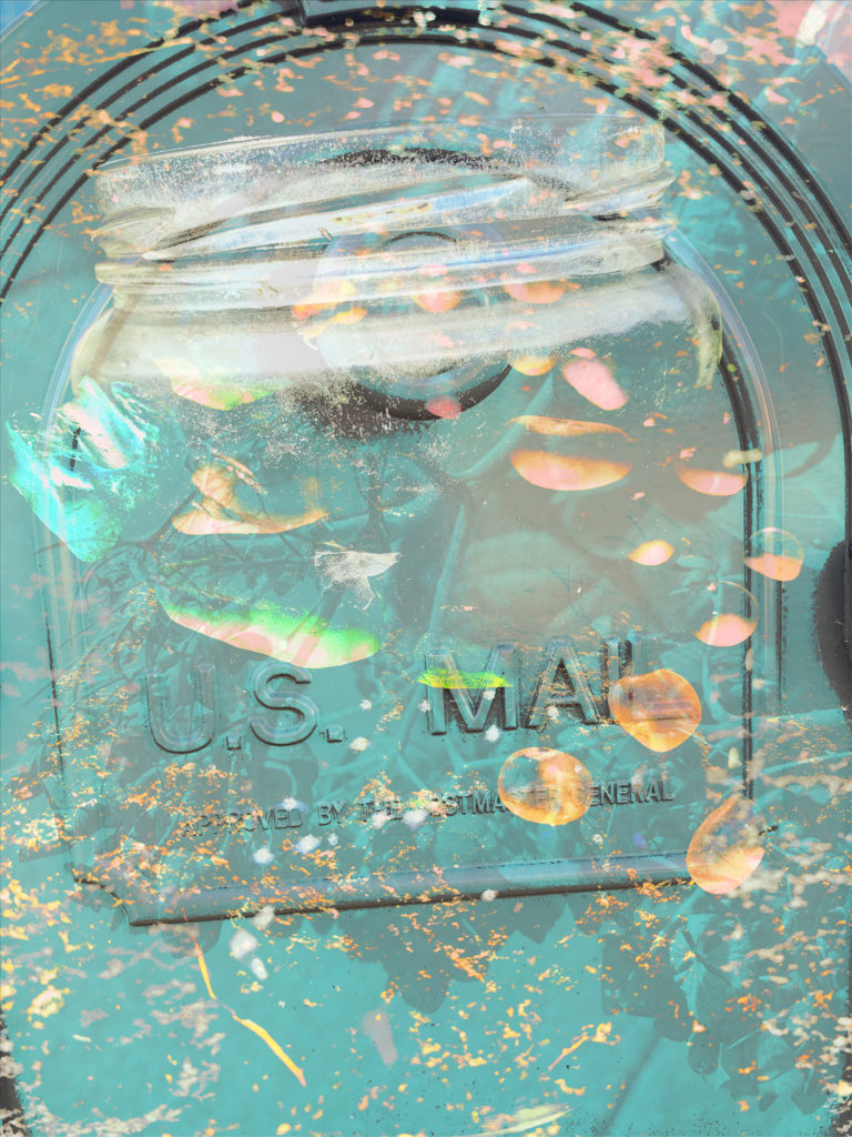
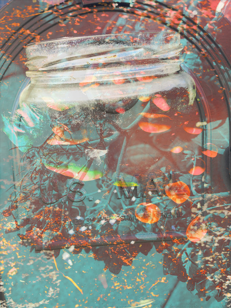
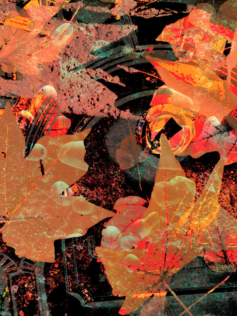
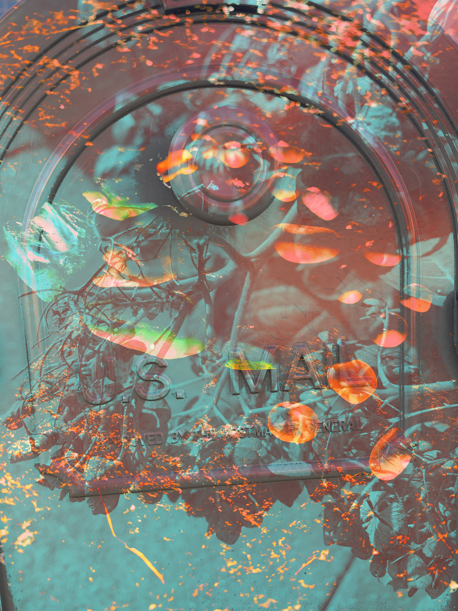
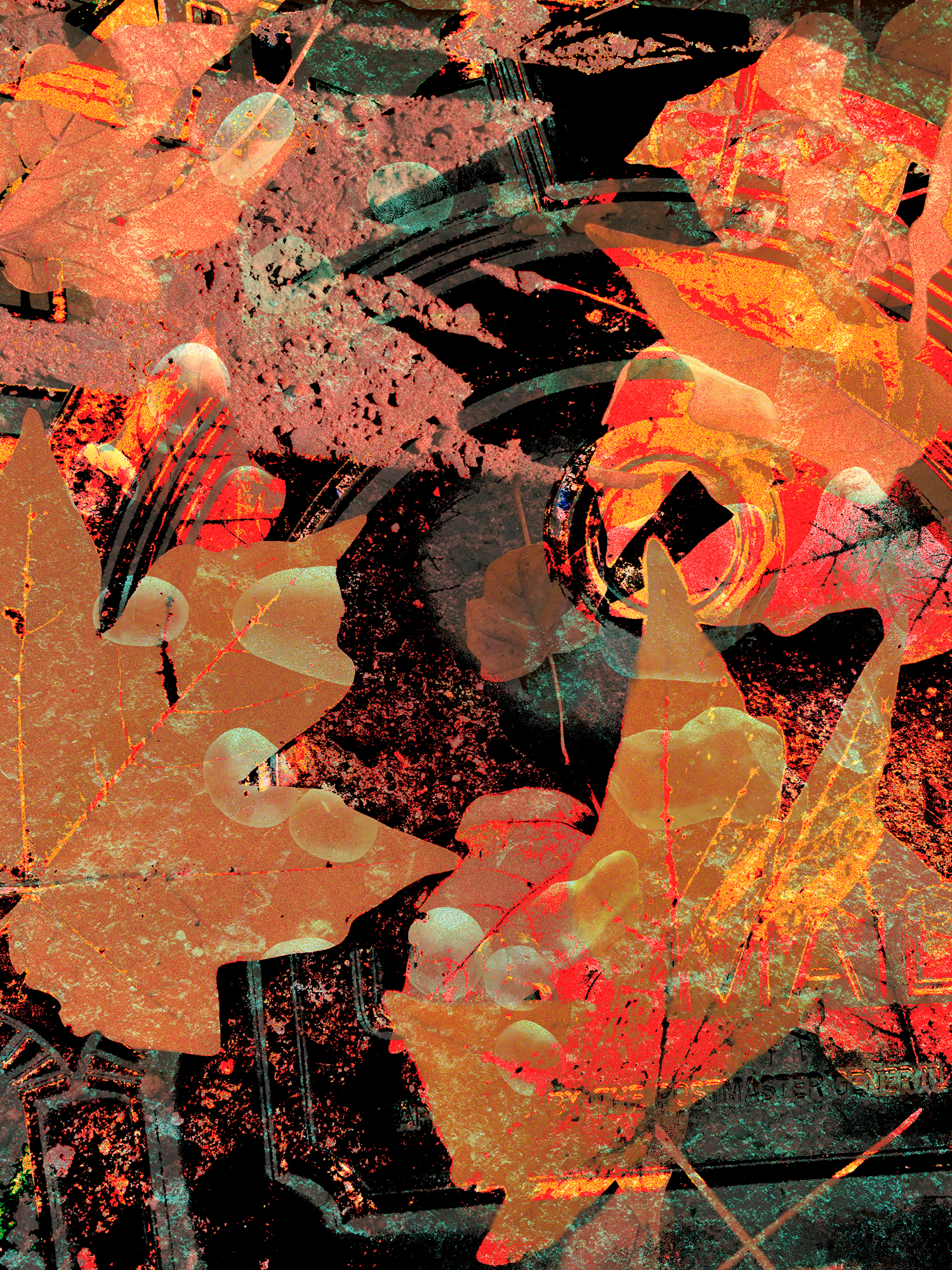
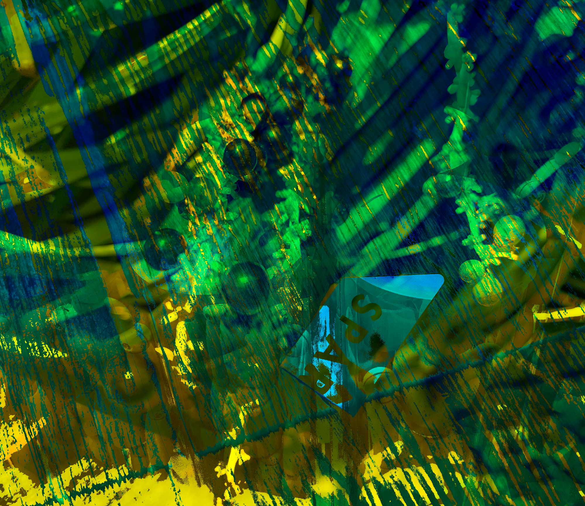
Here are some of the versions I have created so far, I am planning to do some more, but I was hoping to get some feedback for these!
1
2
3
4
5
6
7
8
9
10
11
One thought on “texture project attempts”
Your featured image has the best contrast but could use some better compositional arrangement or an alternate crop. I love the interplay of complimentary colors in the bottom third and the depth of field in your background image. The smaller images feel a bit random despite the nice punctuation of contrast.
Many of the other compositions are very busy and lacking contrast. 2, 7, 9 all have potential with some editing. Perhaps revisit with some crops (maybe more squarish compositions)
I like the arches on the mailbox photo but the typography is a bit heavy-handed.
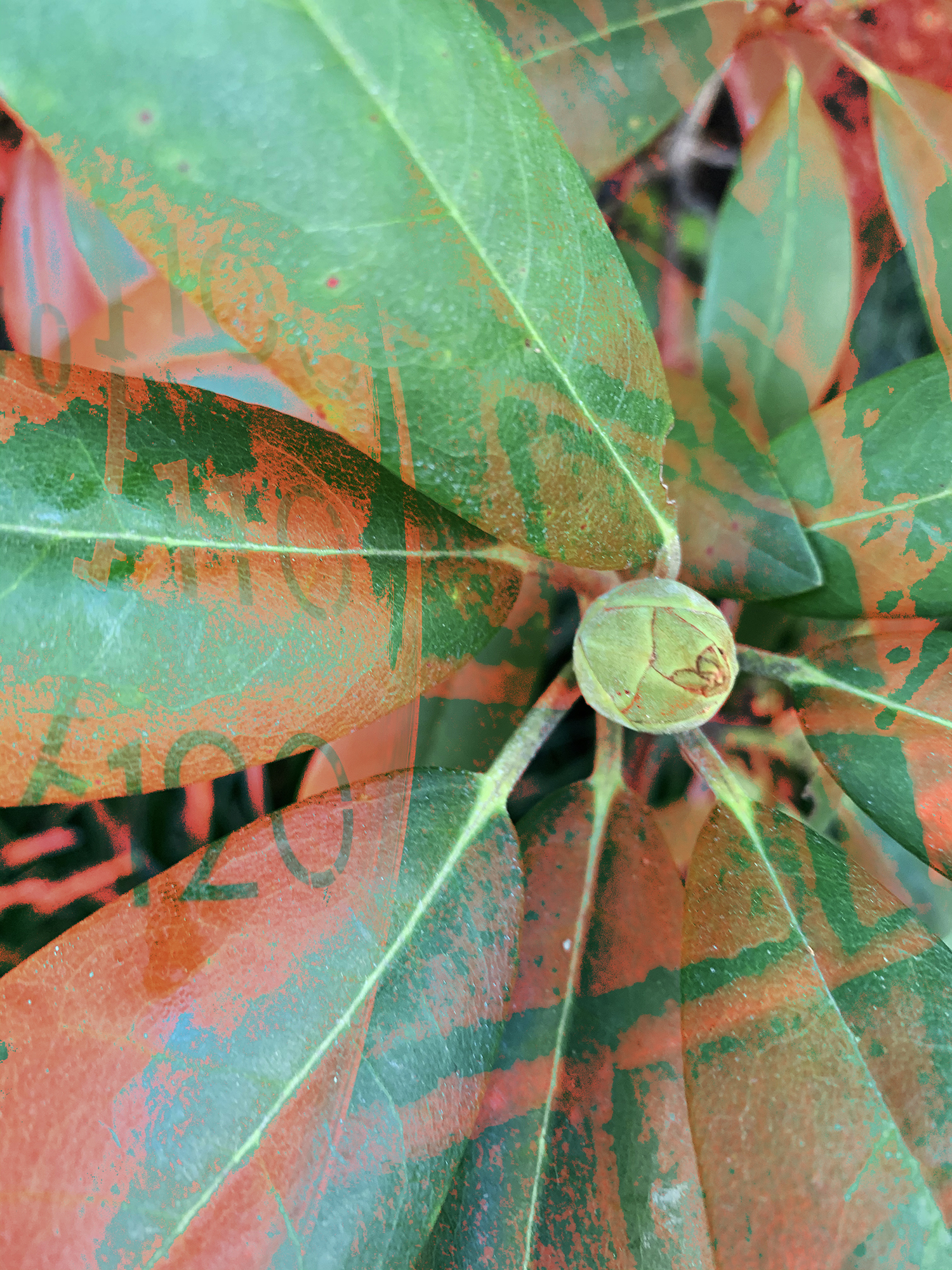
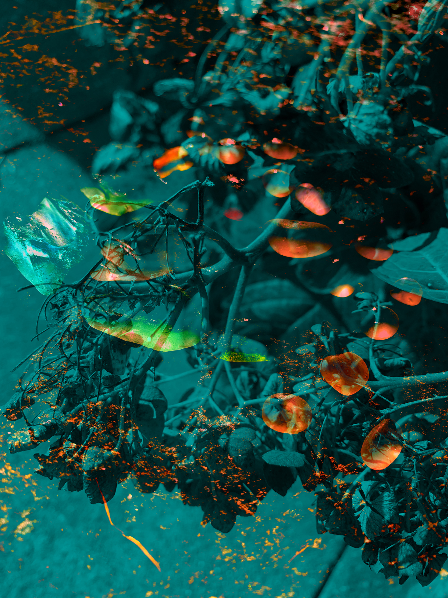
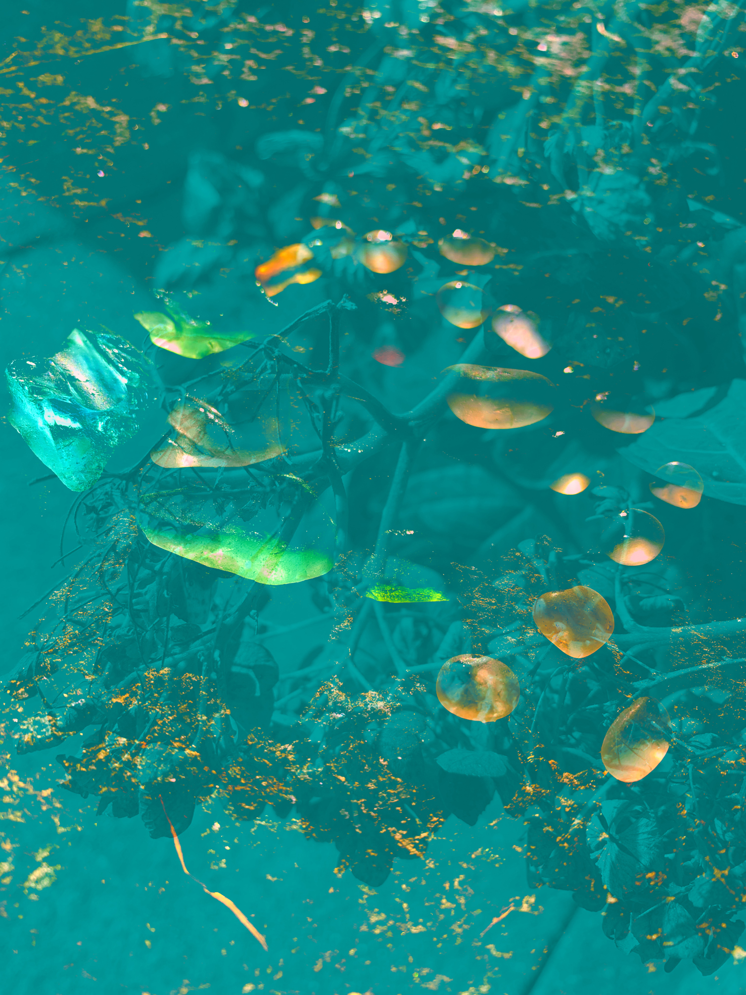