The first image has the strongest contrast and graphic punch. I would recommend inverting or flipping the Lehigh text so it functions less literally and more graphically.
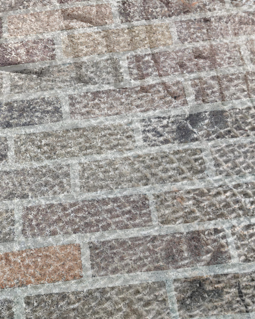
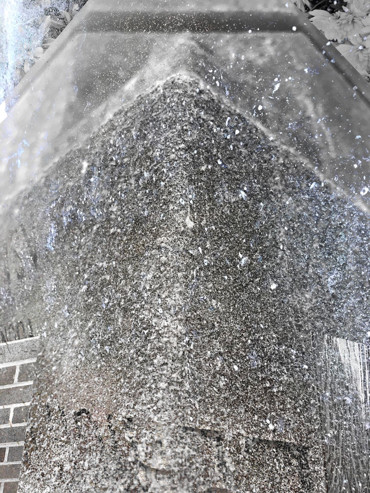
The final two have potential to read like a monolith with some interesting form, but I would stick with symmetry across the board and try ot resolve the yop a little better.

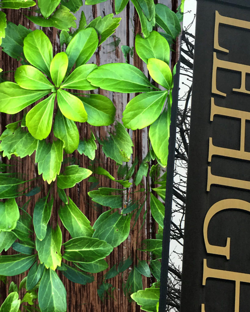


The first image has the strongest contrast and graphic punch. I would recommend inverting or flipping the Lehigh text so it functions less literally and more graphically.
The final two have potential to read like a monolith with some interesting form, but I would stick with symmetry across the board and try ot resolve the yop a little better.