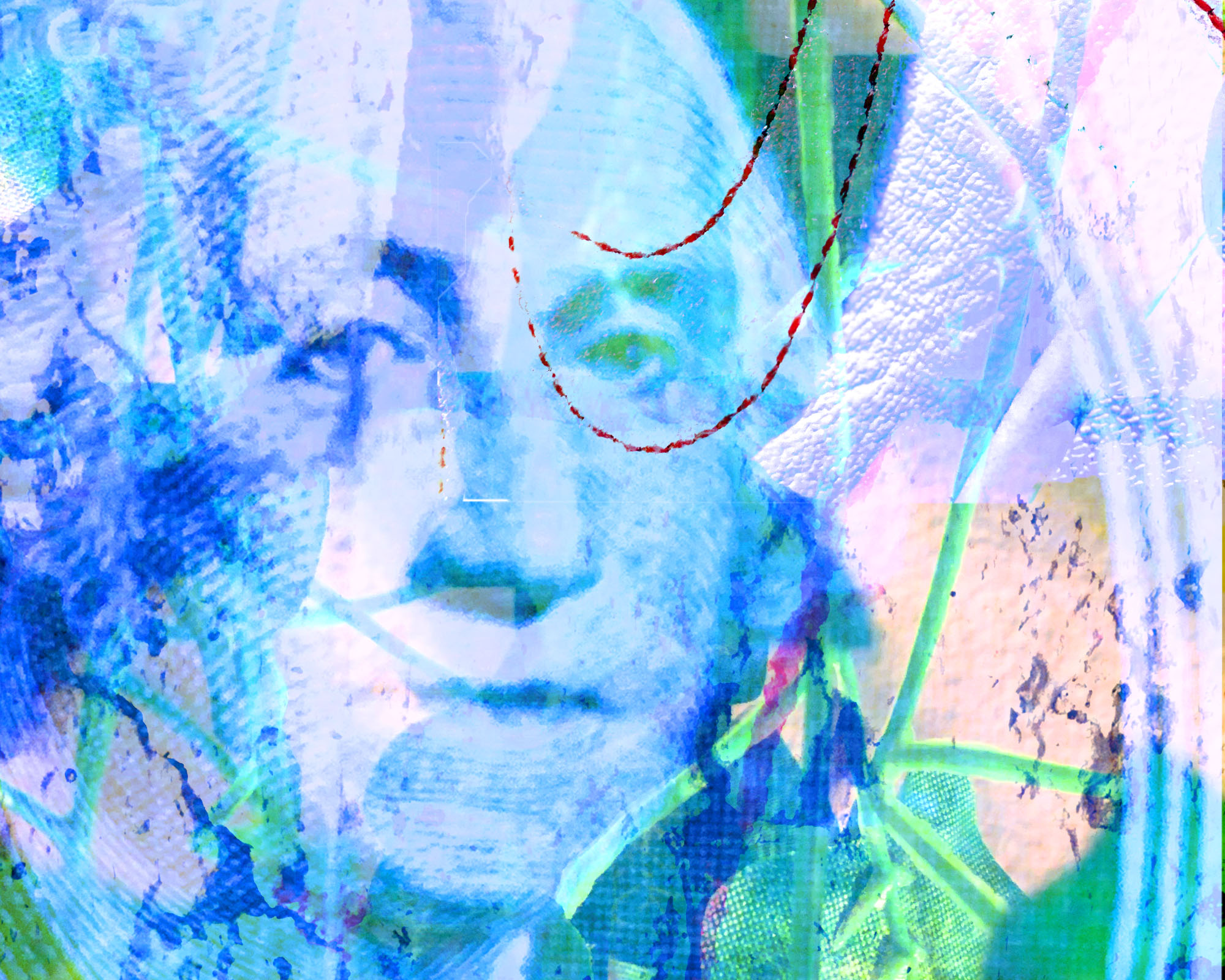
Good color work, but I’m not sure about the stark rectangle in the upper right. Maybe push the geometric divisions further (more of them) or reconsider the placement.
Out of the two, I like the featured composition the best. I agree with Jason that the white rectangle of the nike symbol is too stark. I really like the contrast of the colors and how vibrant they are.
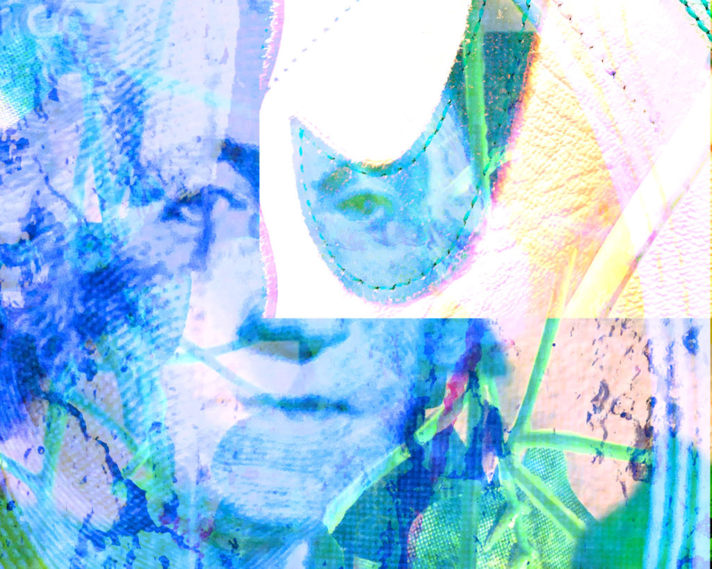