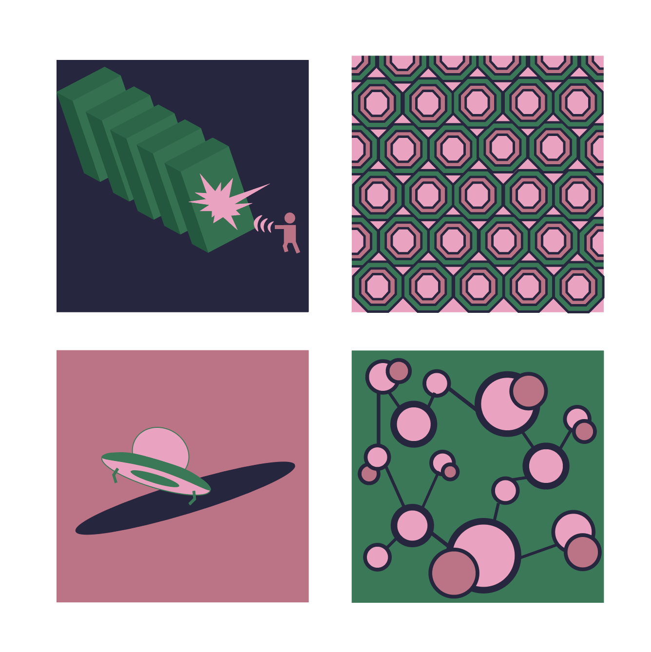
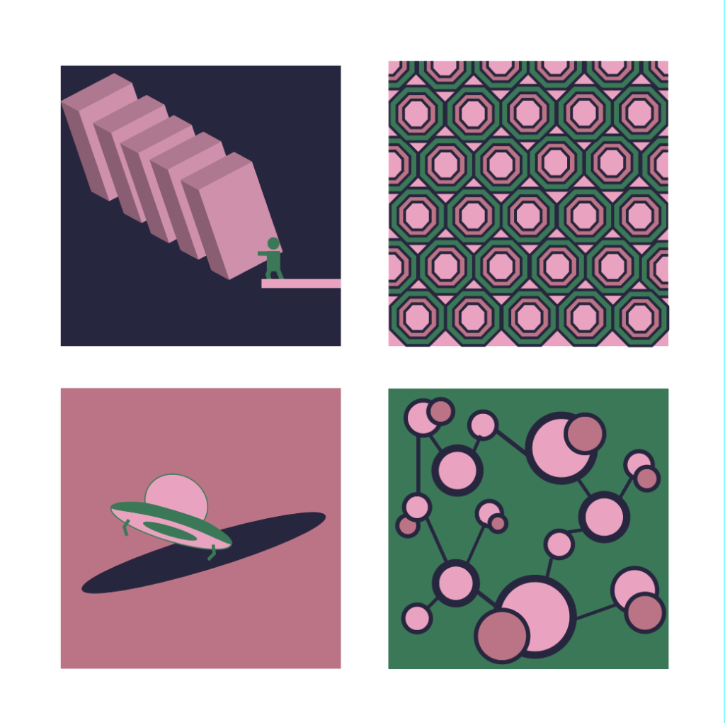
The palette works best with the value contrast on the darker grounds (upper left and lower right)
The top two designs are similar to examples on the web site, so see if you can change them up a bit since we still have some time before they’re due. I like the joinery of the circle design in the lower right, but might try varying the stroke weights since the smaller circles get heavy with the thicker strokes.
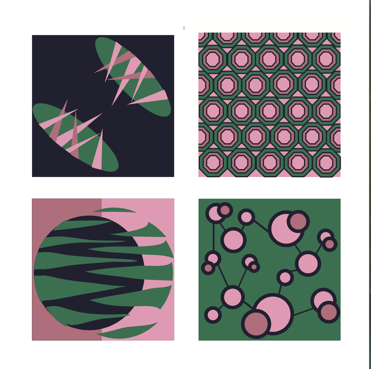