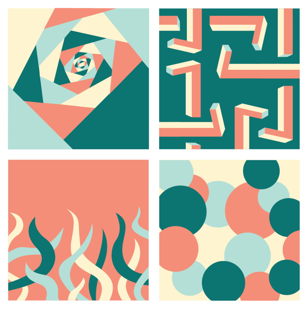
A nice palette with good contrast in value. Compostionally, I like the use of form in the upper right design. It might be interesting to try nesting some additional colors in the shapes in the bottom two (as highlights, offsets or patterns) to create more intrigue.
They do. Perhaps the highlight placement can be more varied on the circle piece, but I like that they can read as more volumetric (or perhaps emoji with eyes!)


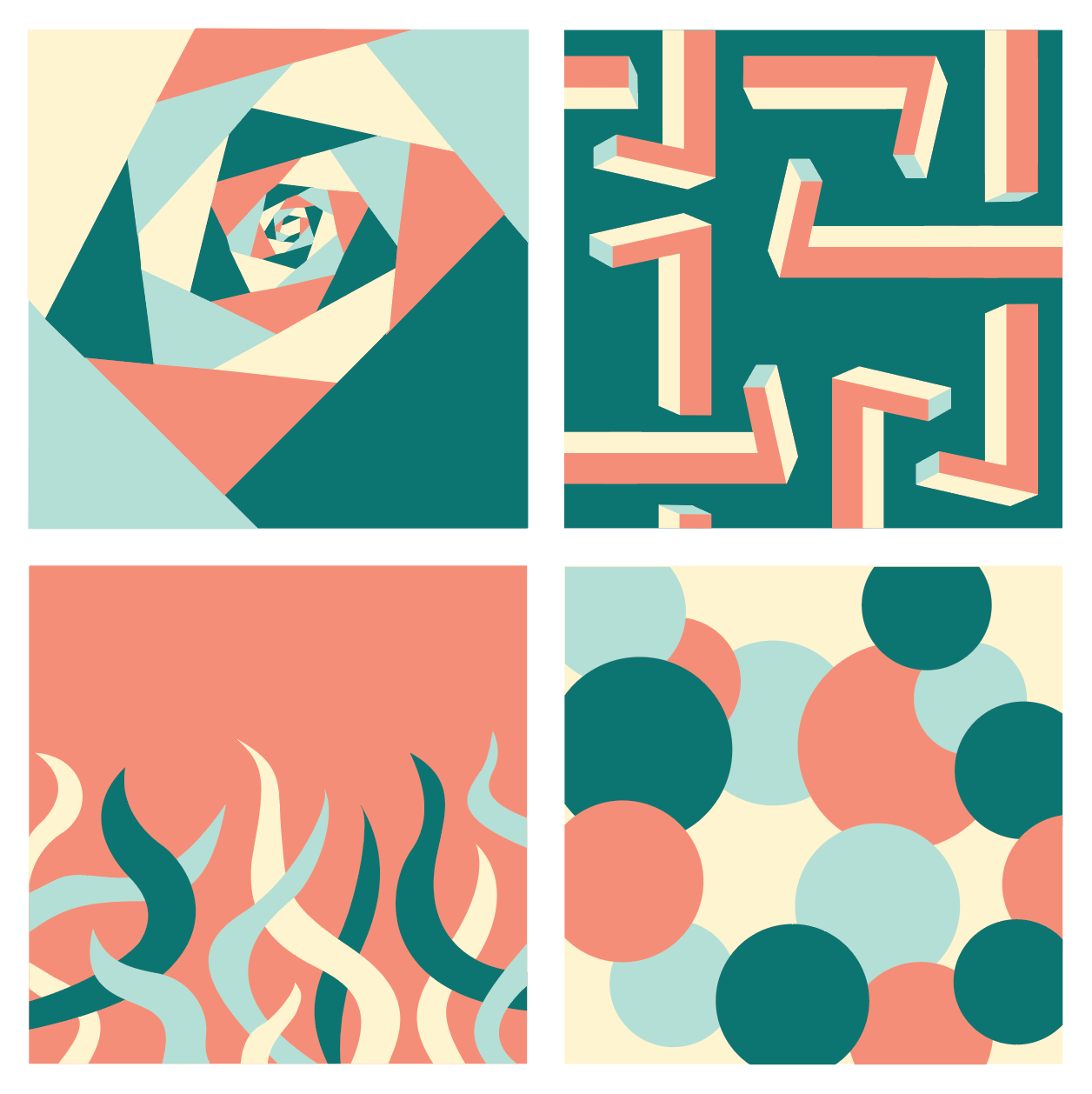
A nice palette with good contrast in value. Compostionally, I like the use of form in the upper right design. It might be interesting to try nesting some additional colors in the shapes in the bottom two (as highlights, offsets or patterns) to create more intrigue.
Thank you! I tried adding some highlights to the bottom designs. Do you think they add some intrigue/interest?
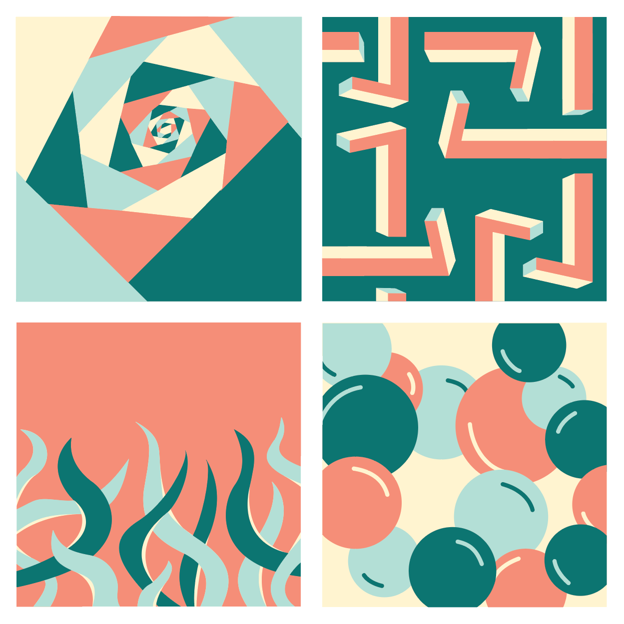
They do. Perhaps the highlight placement can be more varied on the circle piece, but I like that they can read as more volumetric (or perhaps emoji with eyes!)