


Hey there everyone, I would love some feedback on my solutions, a ton of thought went into these and I’m interested to know what you think! I chose to comment on the events surrounding the election rather than the election itself. Thanks!
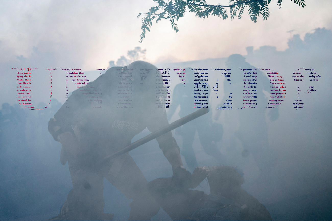
Update: Thanks for the advice Professor! The red and blue were part of the composition, but I tried sandwiching the text between layers in ways I thought added to the solution while also making the text a bit more subtle.
I think the typography could be more subtly integrated. One suggested would be to use a paste-into mask to have the type fill be from the image rather than a solid color (unless integrating the red & blue was part of the concept) To do this you could convert the type to a selection (command-click on the type layer thumbnail in the layer palette to convert it to a selection) and copy and paste that selection from the background layer. You could then use levels to shift the value.
In the image on the right, it might be more interesting to have the type fall slightly behind the figures for better spatial integration. Just copy the figures and foreground to a separate layer and sandwich the type between the two layers.
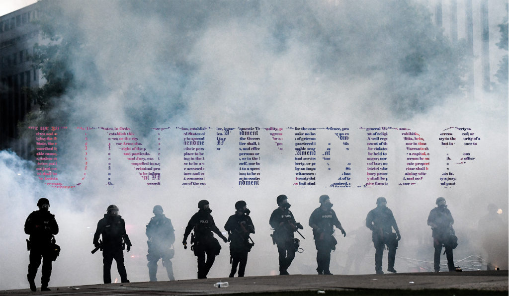
These are very powerful compositions. I like the 2nd and the 4th one. The opacity change of the man on the 4th one brings more depth to your composition. I would play around with the size of “united?” on the page. I think the image and the word, “untitled?” are very powerful – I don’t think it needs to be so big on the page. Let the composition speak more then size of the lettering.
That being said, if you make ‘united’ smaller – you will have to play with the font of the lettering within it’s boarders. Maybe instead of the whole (constitution? i’m assuming) try enlarging some words or phrases that the viewer would recognize as the constitution without displaying it’s entirety. But then again, you don’t want to be to distracting from the rest of the piece. Overall, great work and I like the variation!