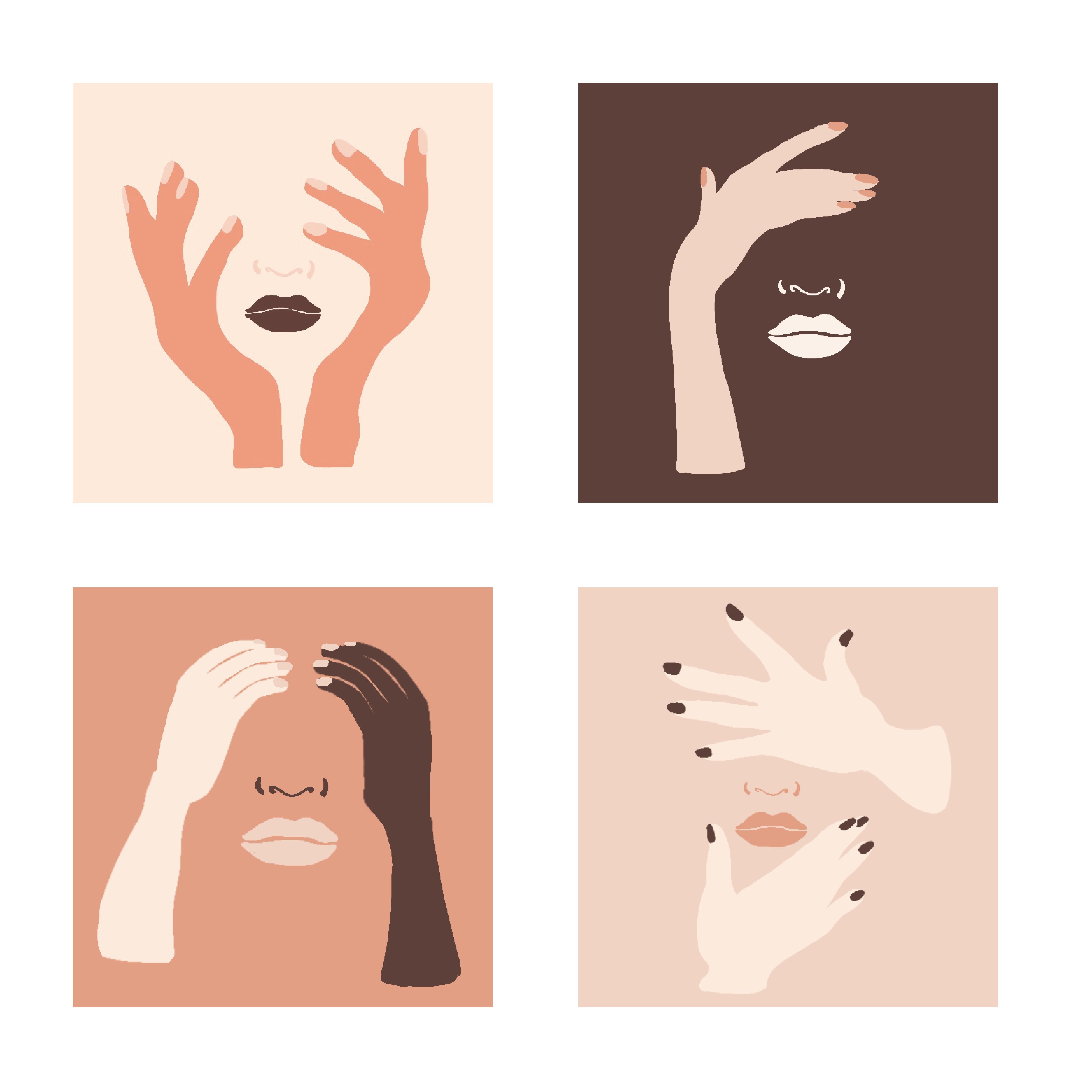
These are fantastic! My only suggestion would be to even out the base of the arms in the lower right design. The other three all have a a nice “pedestal” base with the wrist. Also not sure why these look so pixelated. Malika Favre was the illustrator I recommended looking at. A similar stylistic approach.
These look great! You took a super unique and creative approach that definitely paid off. I like how every square and arm are a different color. You effectively told a narrative just by using different colors and body parts.