A solid color palette with good contrast. The lower left is strongest compositionally. I like the color alternation in the upper left design, but the diagonal wedge going corner to corner feels a bit intrusive. Log in to Reply

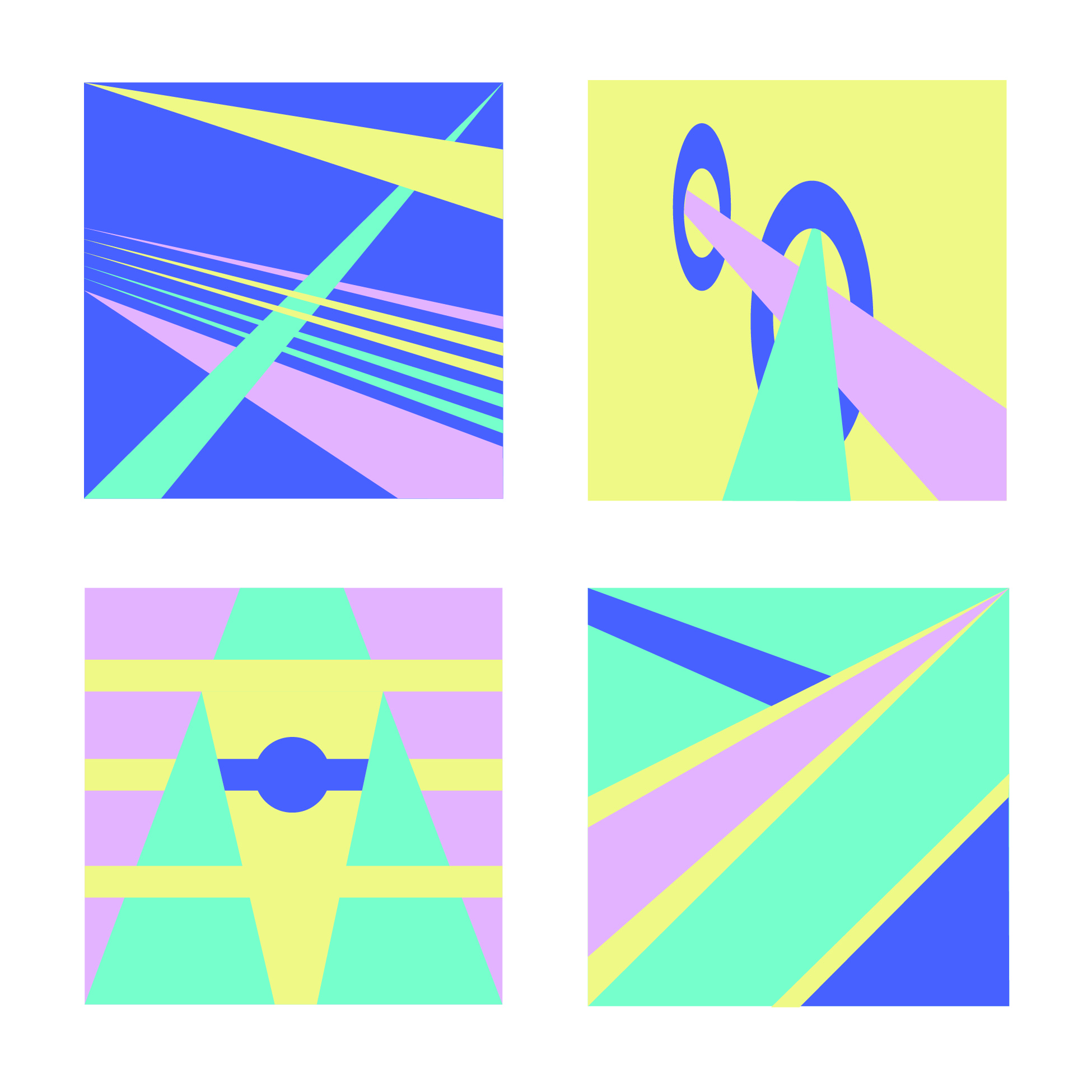
A solid color palette with good contrast. The lower left is strongest compositionally. I like the color alternation in the upper left design, but the diagonal wedge going corner to corner feels a bit intrusive.