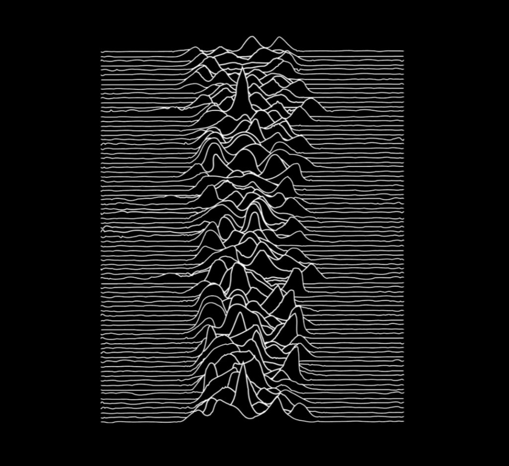
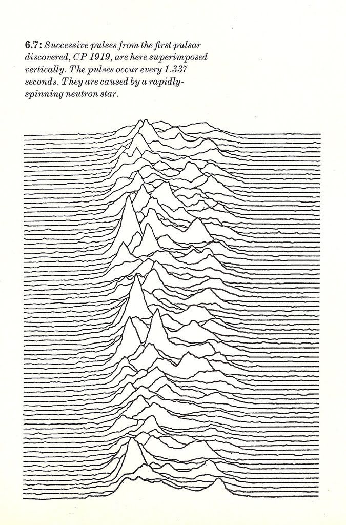
For this assignment, I decided to focus on the album cover for “Unknown Pleasures,” an album produced by the band Joy Division. I first saw this design on a pair of skis, and eventually discovered the significance and story behind the design. I soon learned that this ski design is a slightly altered version of Joy Division’s album cover, which is a slightly altered version of a new pulsar’s radio pulses collected by two researchers from Cambridge University in 1967. This pulsar was named CP 1919, and the waves collected by the researchers were stacked among one another to create an image that was later shared as a plot that could be used to observe these radio pulses from outer space.
With my knowledge of how the album cover came to be, I compared it to the original image that was published in England. Both appeared very similar, yet the album cover appeared to feature slightly smoother lines, which were more appealing to the eye. It is noticeable that the design was modified to meet the desires of the band and record label, but almost all of the scientific plot remained intact throughout the transformation of the design from research to art.
What initially fascinated me about the design itself was its simplicity yet ability to be so eye-catching. Typically, I feel as though I am more drawn to designs with color in them. However, the black and white contrast used in this album cover design instantly makes me wonder about the significance of the design. I at first thought that the design resembled mountains, and was very surprised to learn the true meaning behind the design. As a matter of fact, the design represented several data points, but its orientation and presentation turned it into a piece of art. Designs such as the “Unknown Pleasures” album cover prove that figures and structures can serve as a form of subliminal messaging, because oftentimes there is a significance buried underneath the visual itself. This design, specifically, which is simply a grouping of lines, has me intrigued by the way in which I was able to enjoy the design language and structure of the album cover without even knowing the hours of research and significance tied to the design in the first place.


