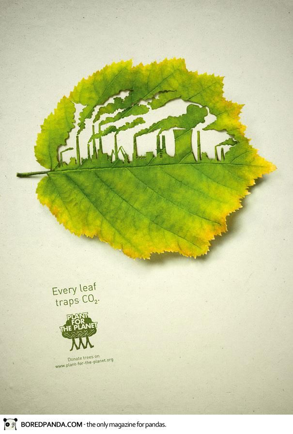
I came across this informative ad form a “Plant for the Planet” ad campaign, and it immediately caught my eye. The image carved into the leaf is strikingly intricate, however the rest of the ad is very simple. This contrast helps the city design to dominate the viewers attention. The carving of a polluted city into a leaf is crazy enough to make the viewer wonder why and how the artist came up with the design idea. However this ad gets its point across in a very simple and literal way. The text reads, “ Every leaf traps co2,” and the art is directly showing the CO2 from a city trapped inside a leaf.
This ad has an important message, and the clarity of the design makes it easy for anyone to understand. It interested me to learn more about the science and the facts of how much carbon leaves could store. I also enjoyed the warm tone in this design. Many climate change posters use darker colors to evoke frightening reactions in this viewer to scare them into recycling, but in this image the only two colors are a warm green and yellow. These warm tones help to create a more positive and hopeful tone towards global warming.


