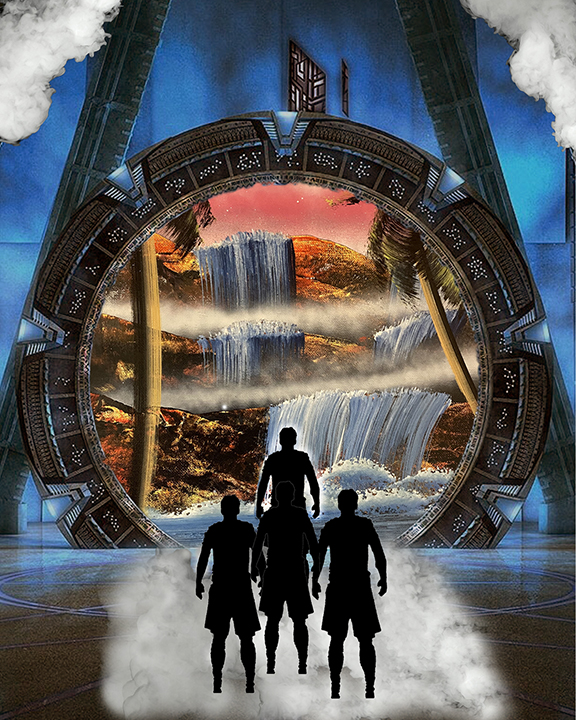
Going to work more on the quality of the images but have this idea to start out. Would love some feedback to see if I’m heading the right direction.
Update: I tried to make the final draft more comprehensive by changing colors and improving the image quality. I also focused more on smaller details.


Conceptually and compositionally it’s fine, but you need to replace the images with better quality versions. Could also use some edits in image adjustments to unify color and contrast. I’ll send a few examples for reference via email.
Thank you!
Hi Drew! I like the overall concept of your portrait but as Jason said, you should try to replace them with higher quality images. I would also encourage you to use the “select and mask” tool in Photoshop after selecting a section to make your figures smooth. Maybe try using a few different figures that have different poses as an experiment. I like the red and blue colors throughout the image.