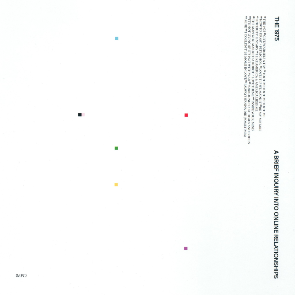
The above picture in the album cover for the junior album of a band called The 1975. When the album first came out and I saw the cover art, I was immediately struck by how vast and empty it seemed to be. To me, it seemed lazy and boring in its feeble attempt at trying to immensely evoke a certain feeling. However, after years of seeing it, the album cover has now grown on me. Prior to my change of heart, the whiteness of the cover annoyed me. However, I now seem to enjoy the sterile and minimalistic vibe of the cover. Also, the brief yet pronounced islands of color force your eyes to sail from square to square which can be pleasant.


