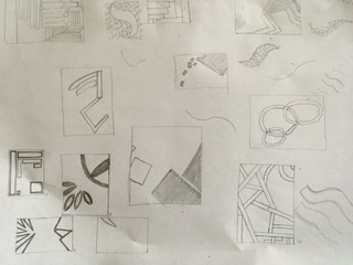
Attached are images of my four line compositions for this project. First is the horizontal/vertical submission, second is the all diagonal lines submission, third is all curved lines, and last is the combination of all four line types.


You must be logged in to post a comment.
Love the diagonal and combo designs! (I’m not sure why the diagonal thumbnail is in a different orientation than the enlarged view so maybe you can see if you can fix that.)
I like the central element in the curve design but the other elements crowd it a bit. The h/v piece loses some of the intriguing scale narrative you had in the studio version. I think even rotating it 90 degrees counter-clockwise might give a better spatial and architectural read.
If you have time to tweak these prior to crit feel free, but overall a great job!
Hi Teasha! I definitely agree with Jason here, you did a really great job overall. I love how in your diagonal design you leave a lot of white space in the middle. It’s easy on the eye and I wonder how it would look if you flipped the paper to be portrait instead of landscape. I also really like the tiniest rectangle in your horizontal/vertical piece and how it seems like an outlier compared to the rest of the blocks. I think that one has a nice narrative to it.