
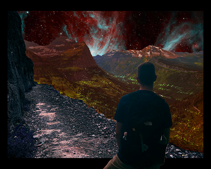
The start of the journey, I didn’t like how this looked so I continued on. 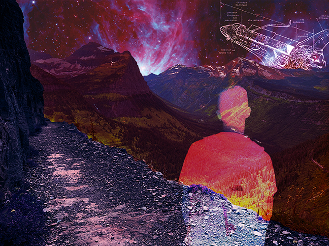
The first portrait I really liked, the rest play off this. 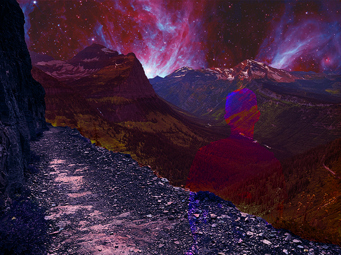
Tried a different blending mode. 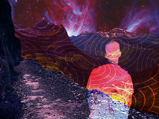
Circles on the mountains! I tried to add value to the portrait without cluttering it, and I loved this pattern. 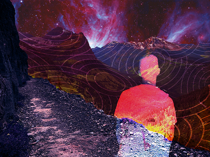
Couldn’t decide whether to have the circles bleed through me or not, so these last two are essentially copies save for that one distinction.

This is trippy. I like that you made your whole composition based on underlays and opacity change. It’s a very beautiful aesthetic and I’m glad you tried many version before settling on a final. It’s easy to get lost in the infinite possibilities of what a design could be. This is something that I still struggle with as a designer.
The graphicness of the circles on the mountains intrigues me. I kind of want to see the circles and mountains blend together to create one cohesive, interesting, mountain texture. Like instead of the black on the circles, mountain picture, with the white circle lines on top – yet all still within the shape of the mountains.
Just a thought. Overall, this is awesome.