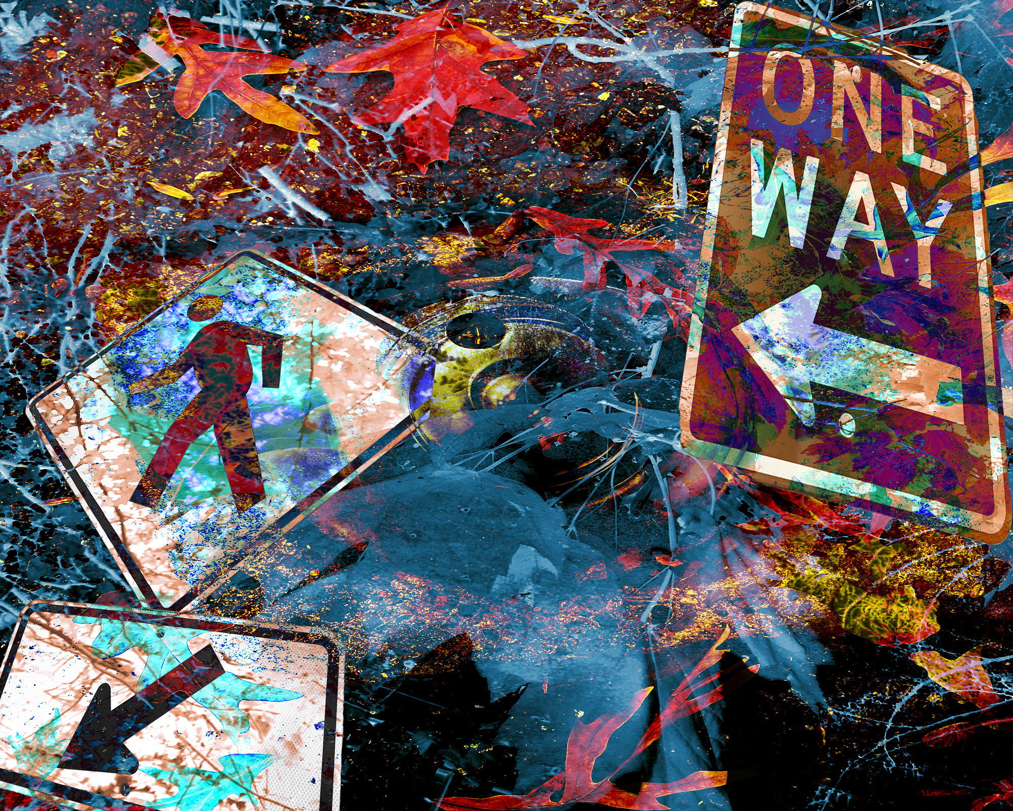
these, but I feel like they’re compositionally weaker than I’d like them to be – any advice on what works compositionally and what I should tighten up would be much appreciated!
Service médical à domicile de Medici Generici à Rome
Notre équipe fournit un service de soins de santé à domicile, garantissant professionnalisme et confort pour les patients à Rome.
class=”wp-image-6623″/>
One thought on “Texture, Work in Progress”
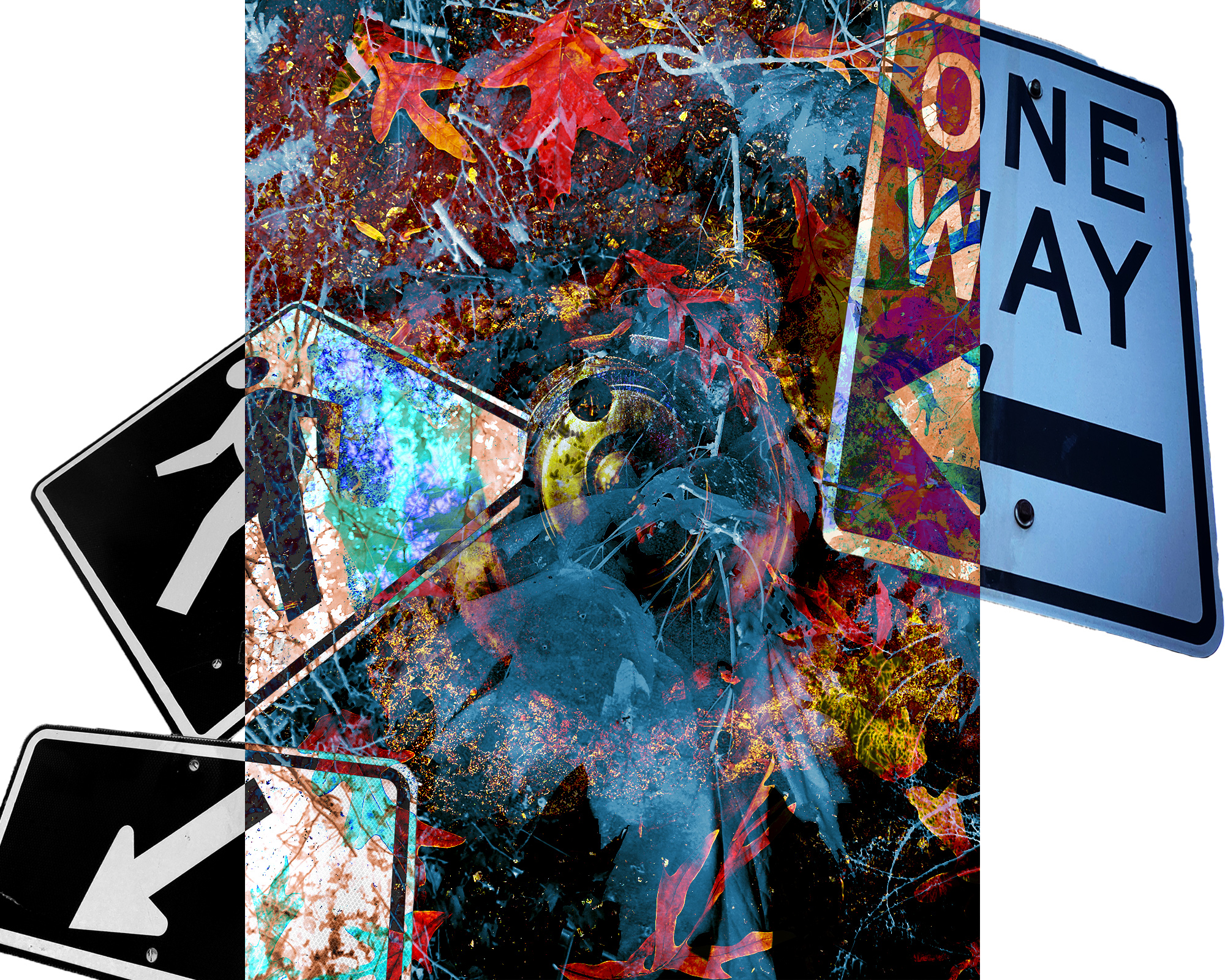
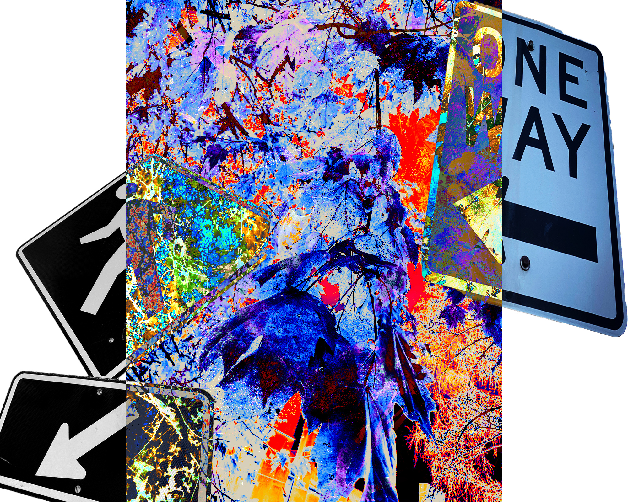
Love the concept of the signage to create some movement, space and graphic impact, but I agree the placement and composition could be more dynamic. Perhaps try varying the scale of the signs and maybe try some alternate crops (so all signs aren’t seen in the entirety) and placement that could create overlapping.
Feel free to explore options other than 8 x 10 too. Square could be interesting.
As far as color, I think your featured image utilizes contrast and saturation nicely on the painterly and expressive textures with the exception of the cool blue in the lower center which feels off key> Perhaps esee what it looks like with that element omitted.