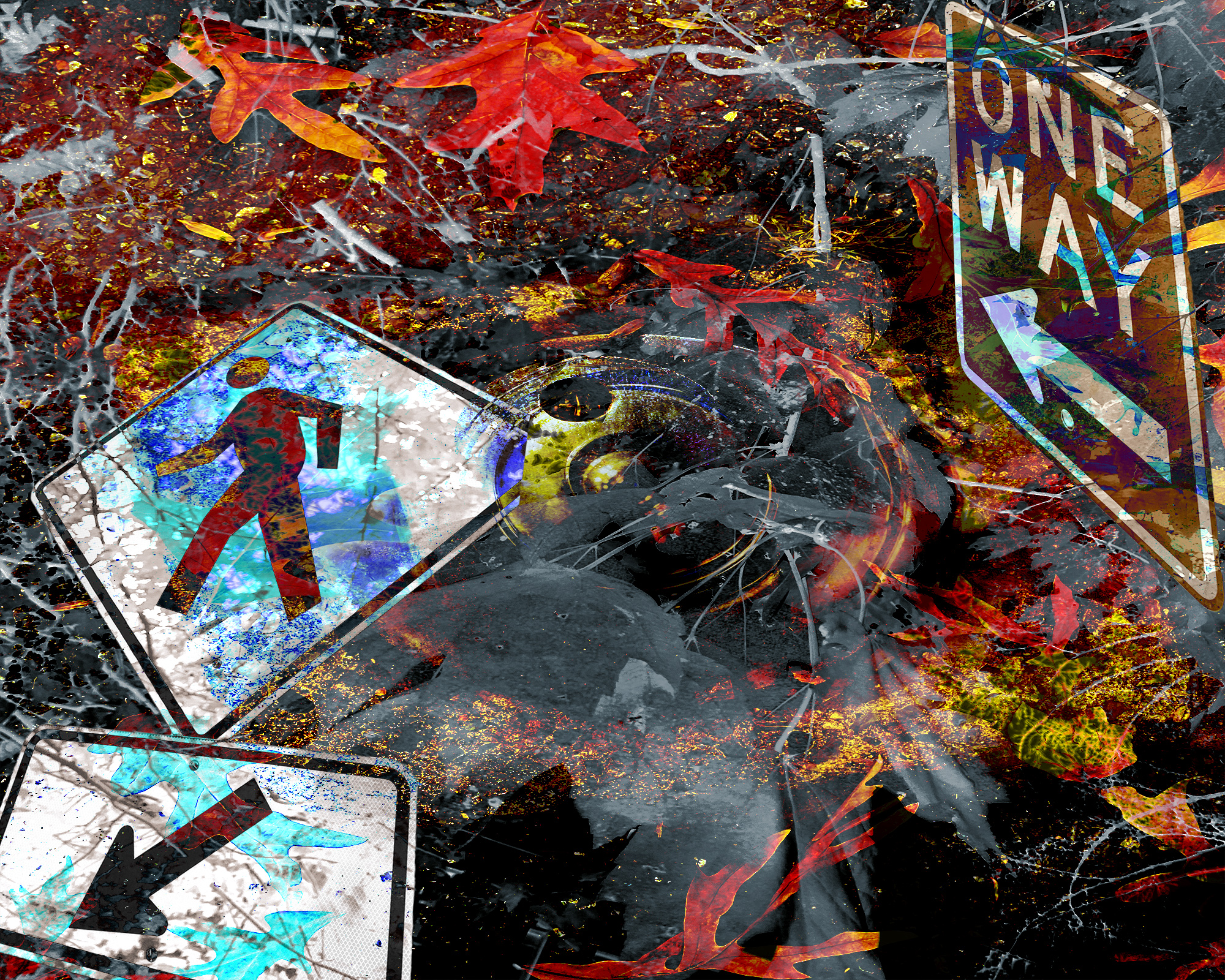
Not sure if the new signs add to the composition or make it too messy – tried to play with perspective and scale on the signs a bit more.
One thought on “Texture, Work In Progress (2)”
Still a lot of dead space in the middle, but I think the square format is on the right track. Think more about how these signs can carve up the ground space in an interesting way. This may necessitate scale increase of some signs and better cropping. The lower left crop with the arrow sign is more what I’m envisioning.


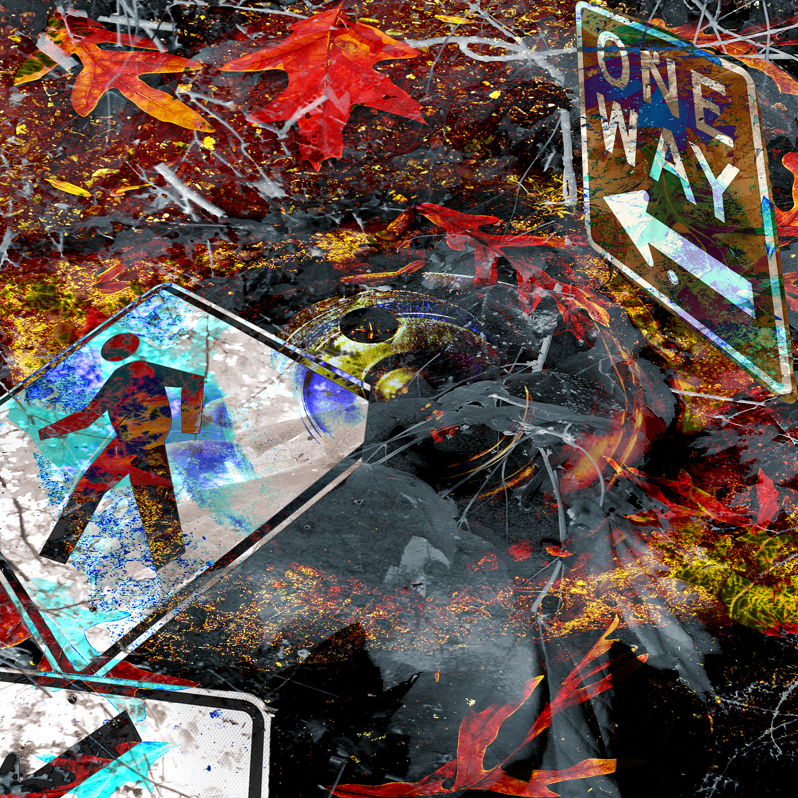
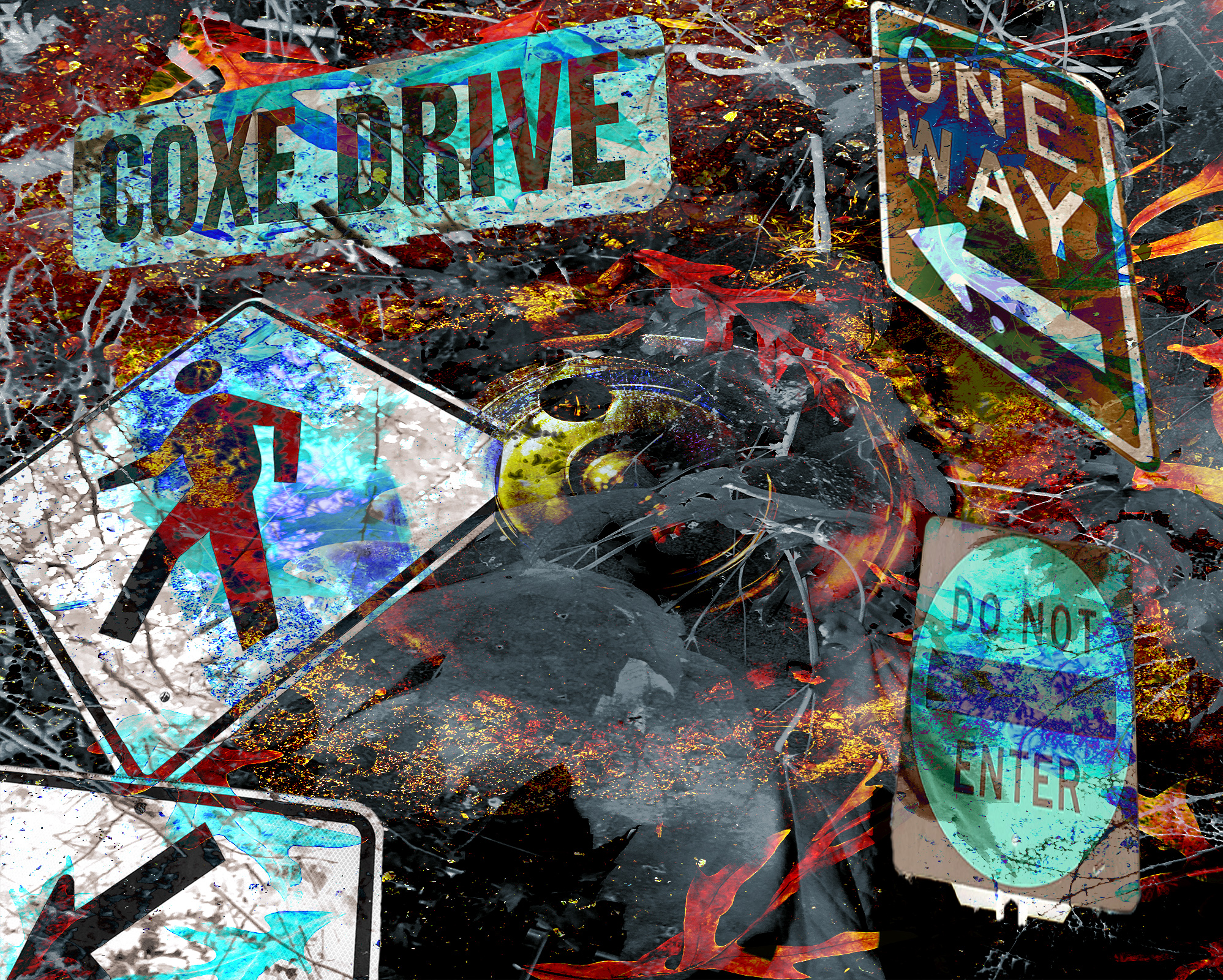

Still a lot of dead space in the middle, but I think the square format is on the right track. Think more about how these signs can carve up the ground space in an interesting way. This may necessitate scale increase of some signs and better cropping. The lower left crop with the arrow sign is more what I’m envisioning.